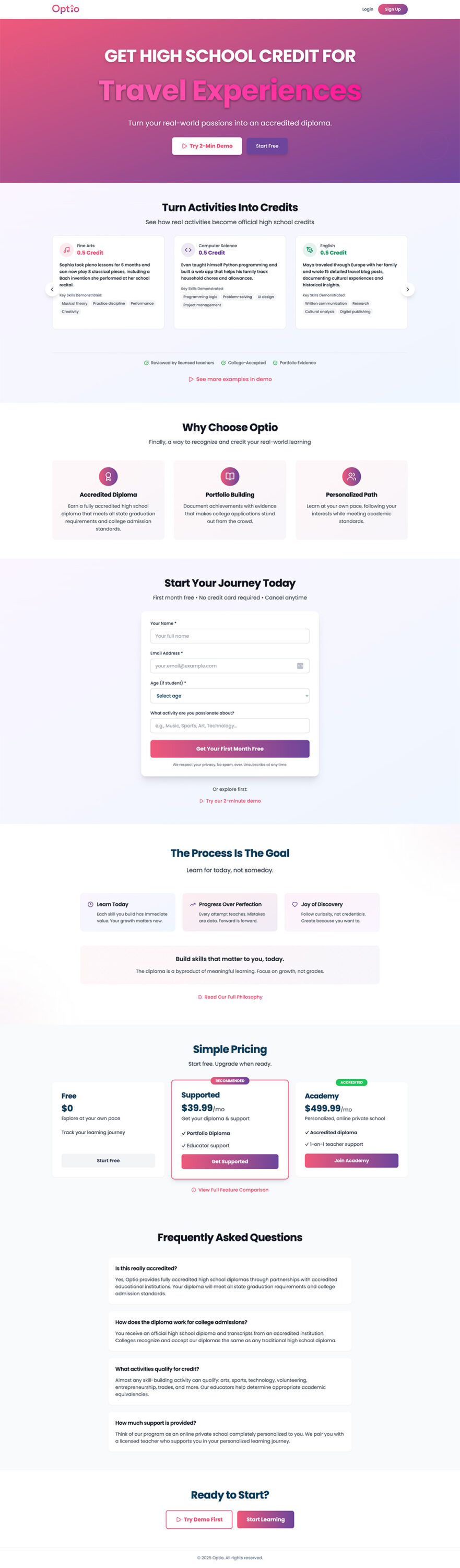
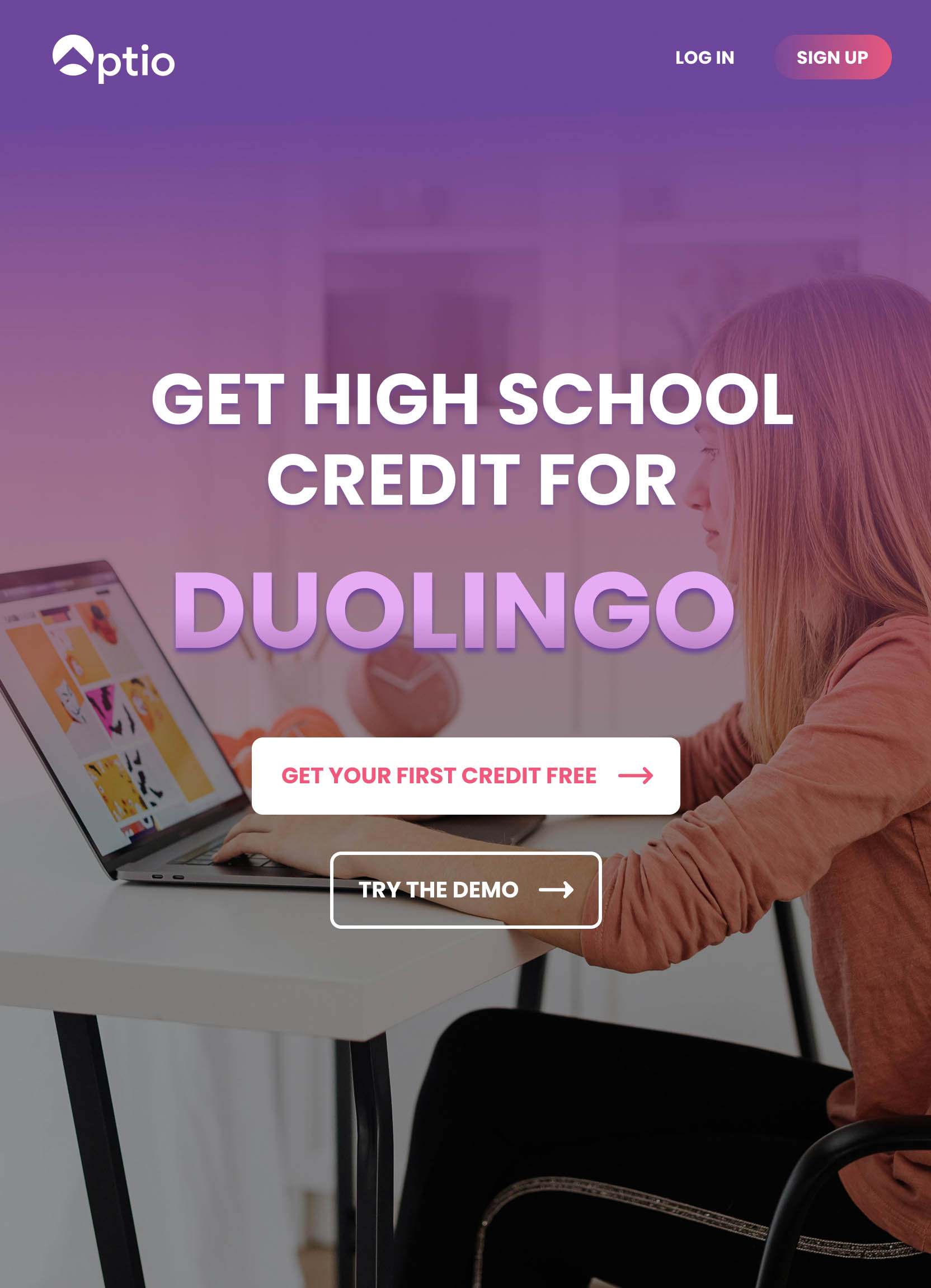
Optio is a child company of Zion Forge. After joining Zion Forge, they requested full branding, a website, and an app design rework. After reviewing their budget and materials, I decided to focus on a simple web design rework that would scale easily to mobile without much design effort and help build the beginning of an engaging, "Duolingo-esq" brand.
After building their brand and helping them secure over 30k in initial funding, they needed to slow their design needs in favor of code and development with furthering the UX/UI of their platform scheduled for late 2026.
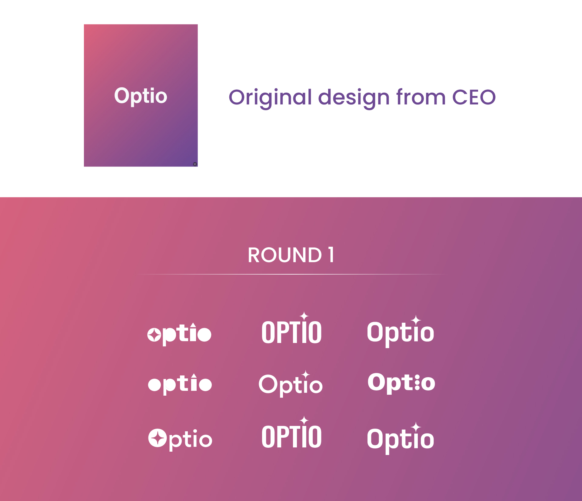
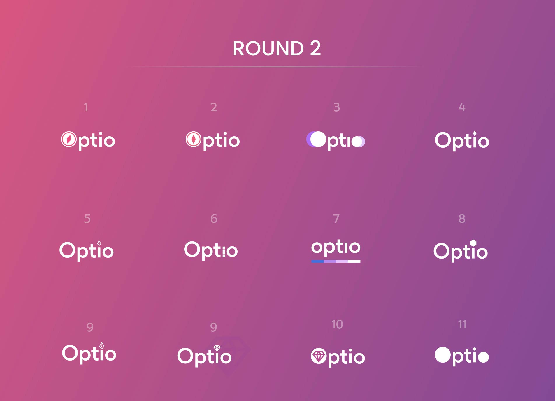
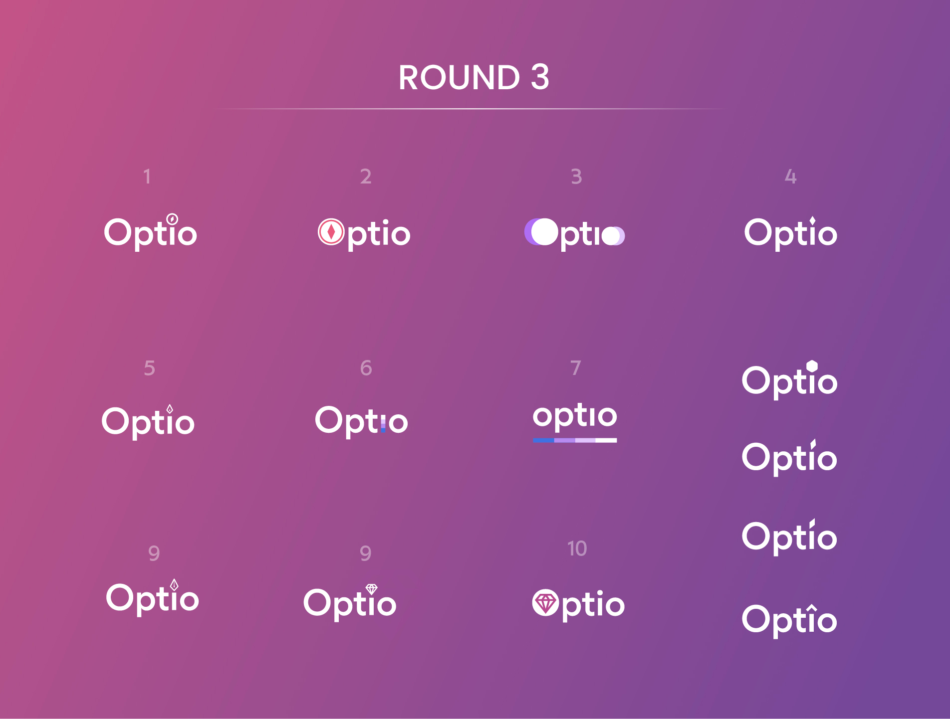
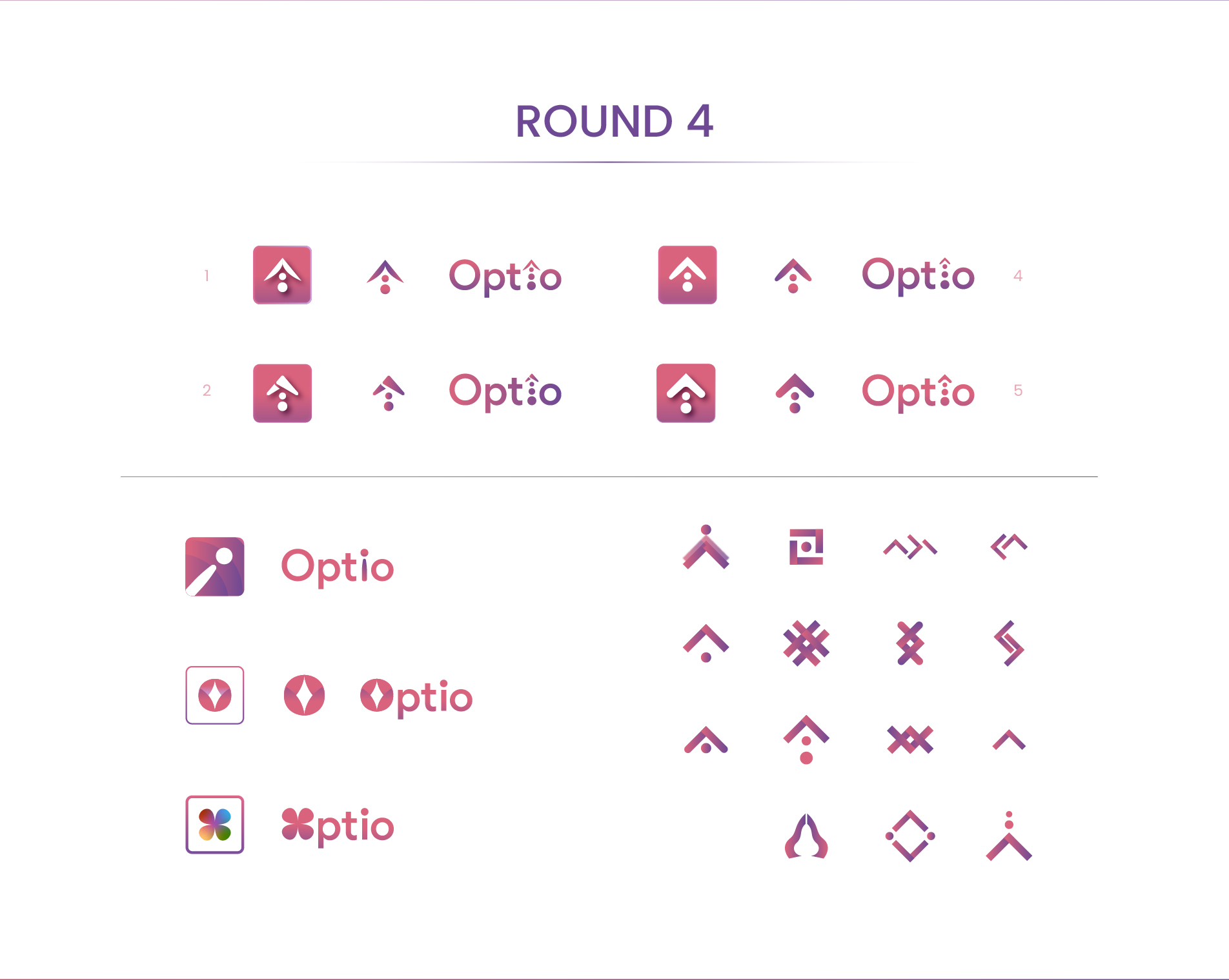
BRANDING
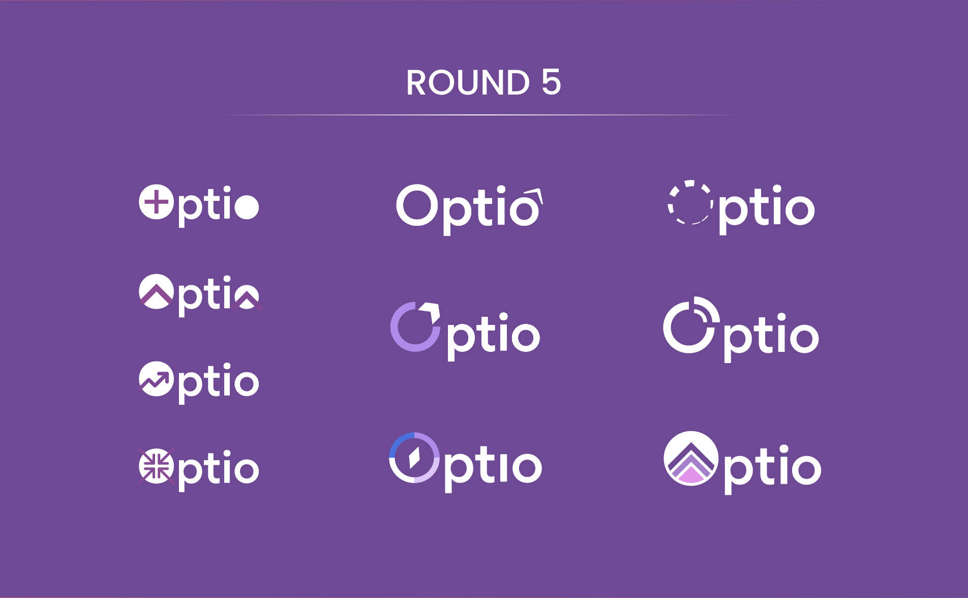
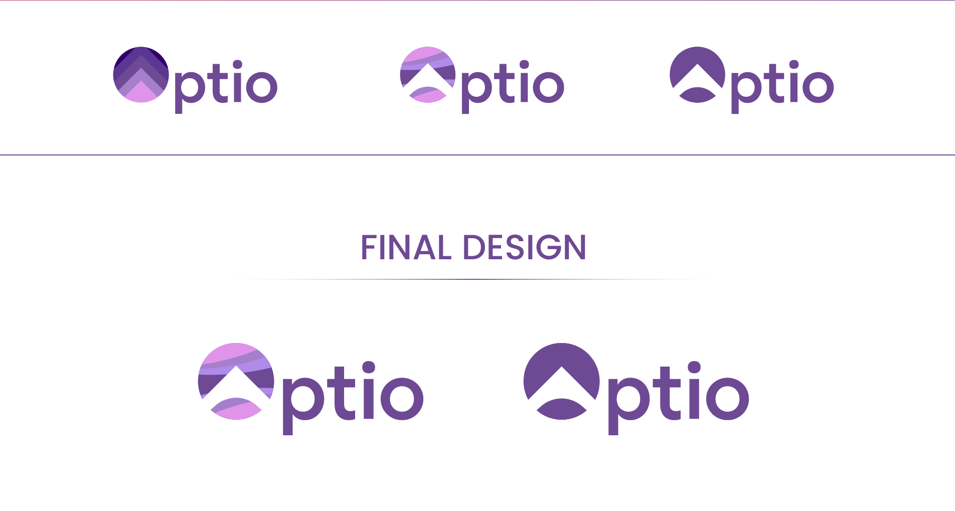
With Optio hoping to expand to a full educational tool serving K12 as well as B2B integration, the logo design hinged on held meaning through simplicity, modernity, upward trajectory, and home. Overall, from first texting conversation to final logo design deliverables, the process took 2 days of work time spread out over two weeks. My focus was on submitting a plethora of logo options in order to narrow down my client’s vision while keeping discussion limited to 2-3 texts between rounds.
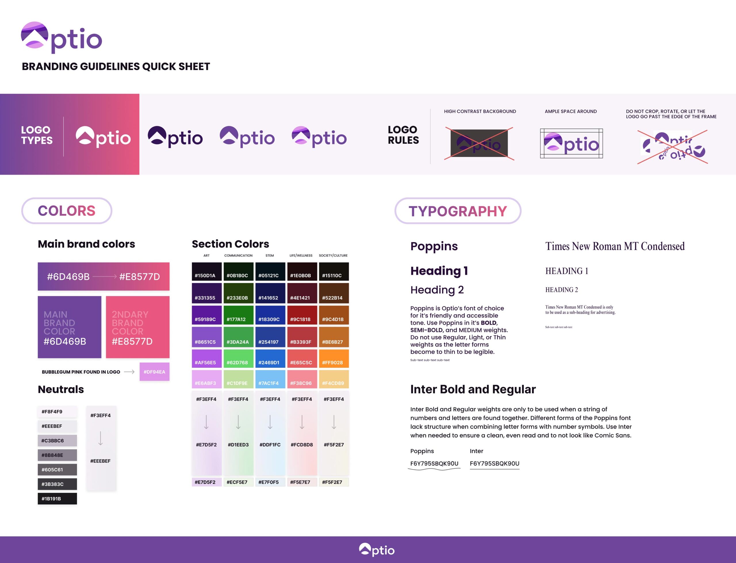
Branding Guidelines Quicksheet
There became a need for other team members to have branding guidelines but without the funds necessary at a pre-seed startup I found a “Quicksheet” to be the answer for internal use. I created font solutions, a tiered color palette with separation for general use, a complex palette for illustrators, and full UI color options per curriculum type.
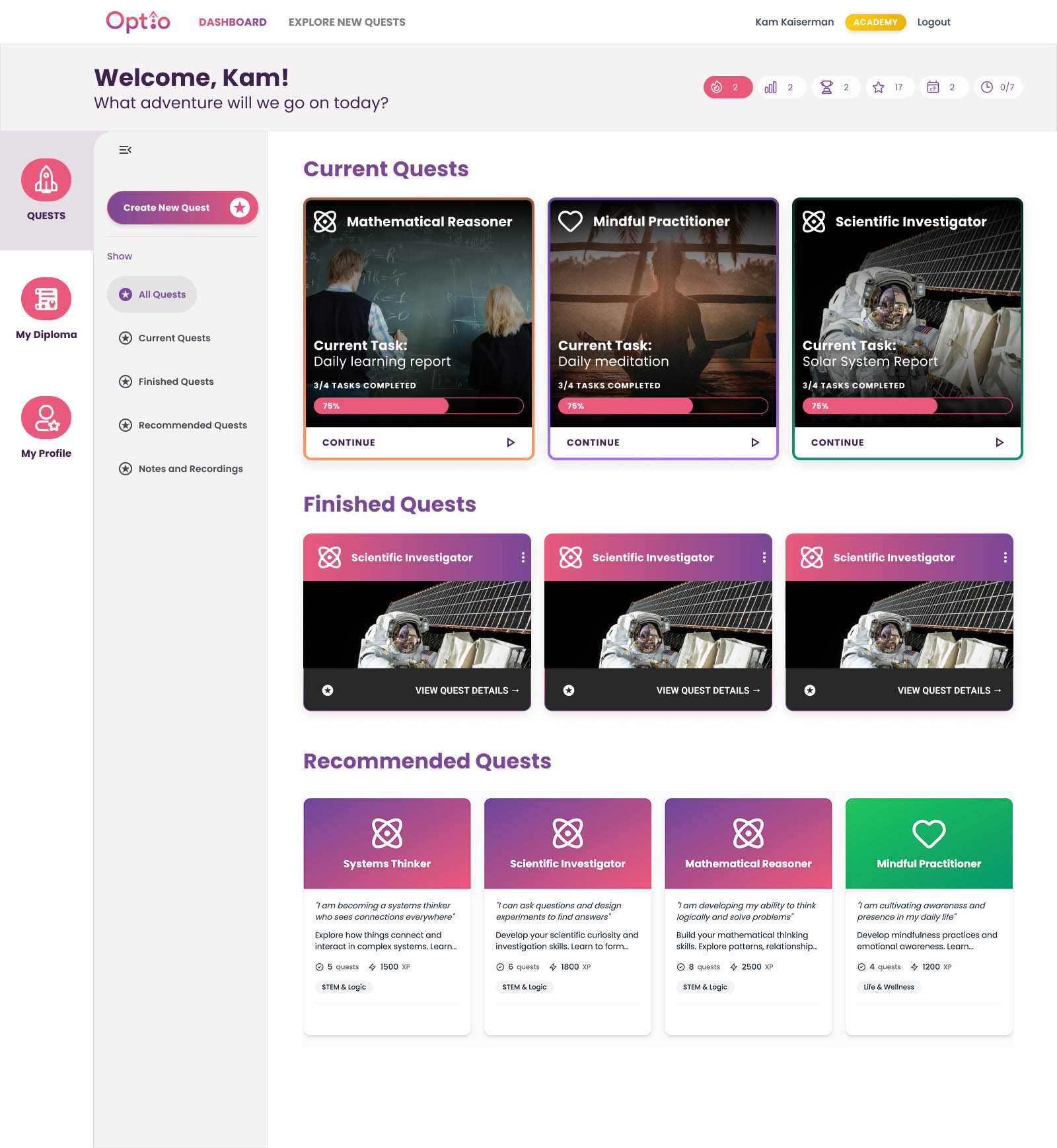
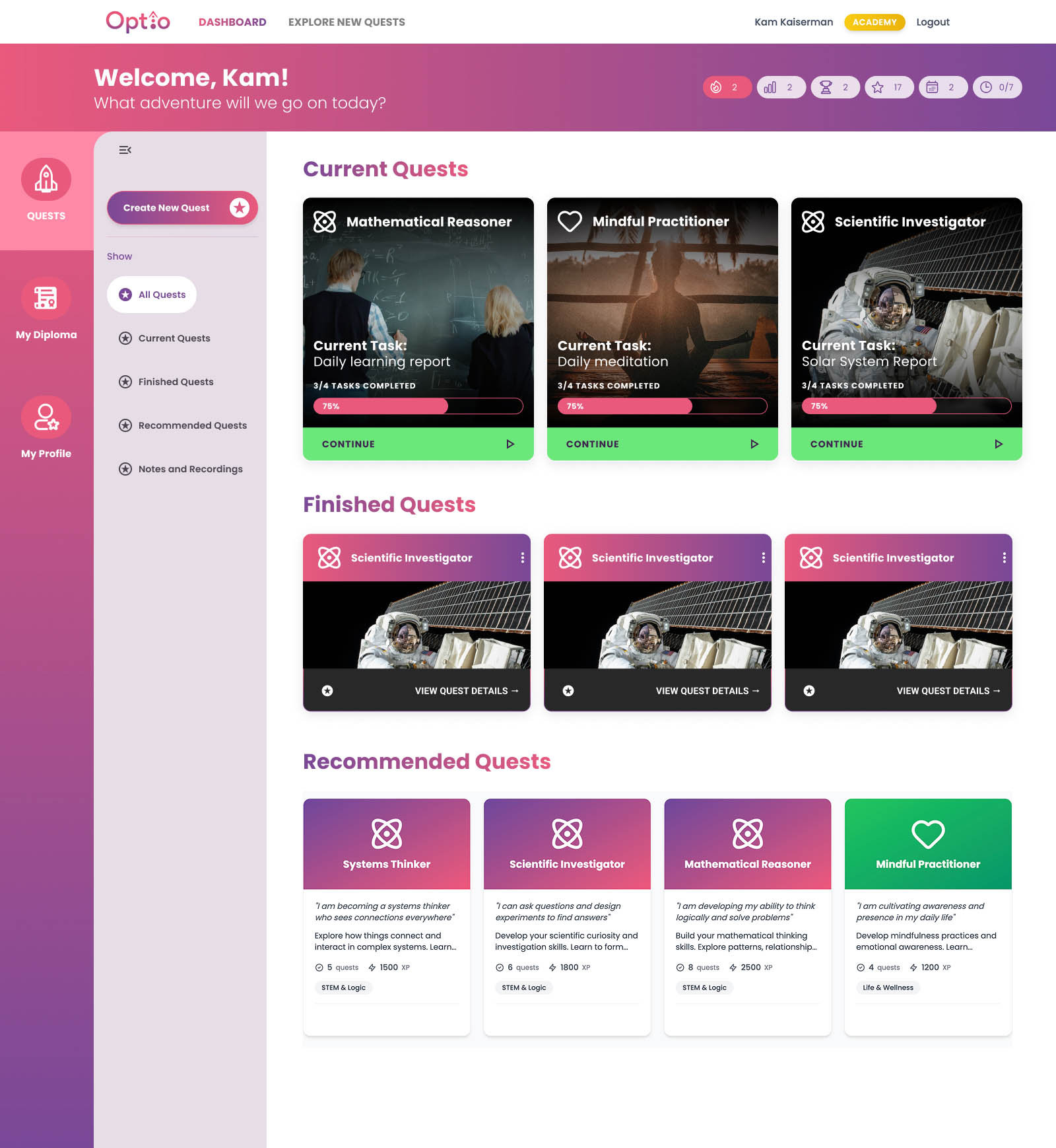
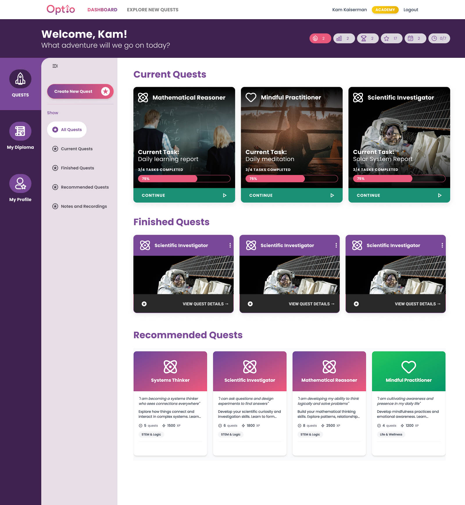
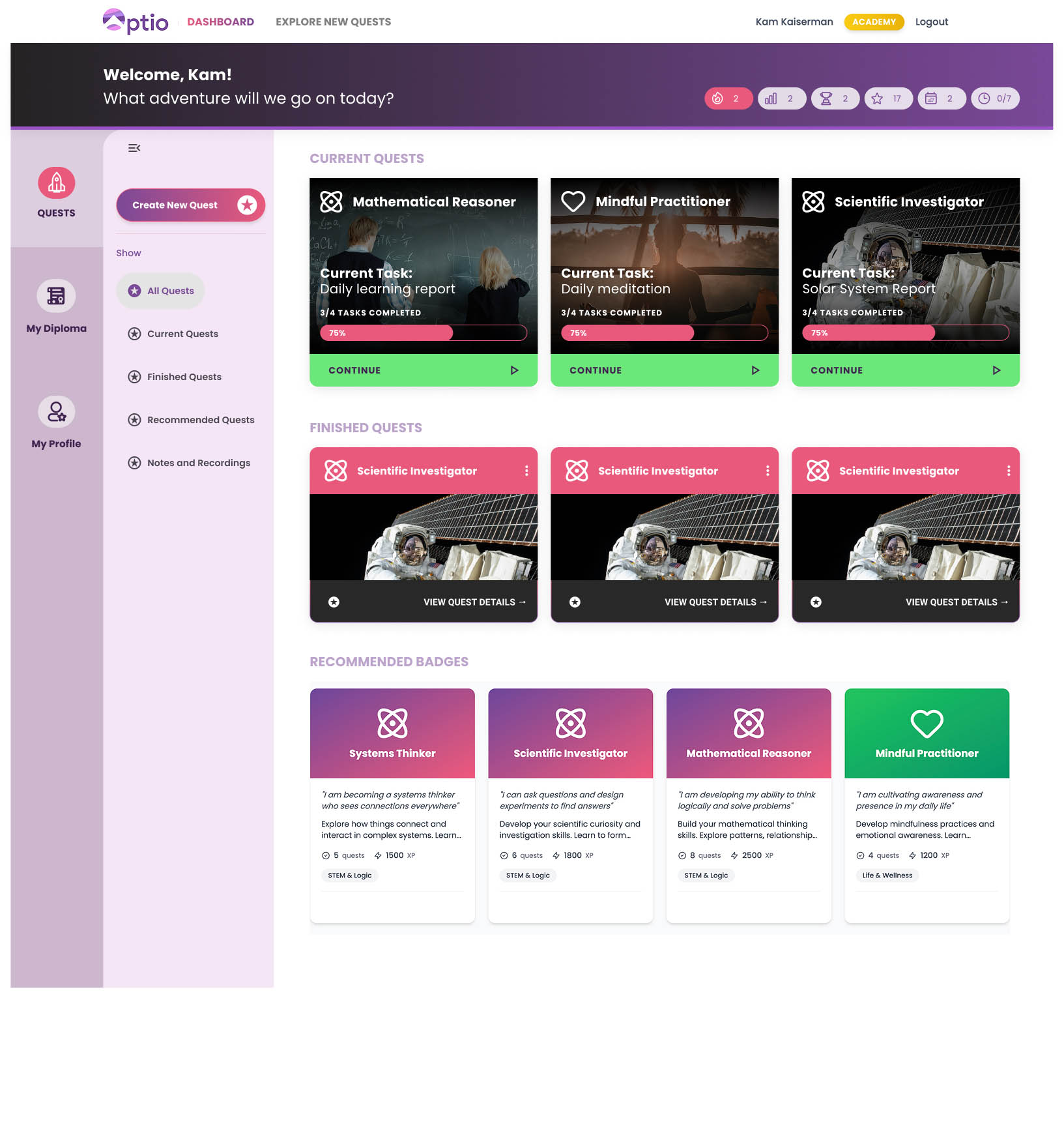
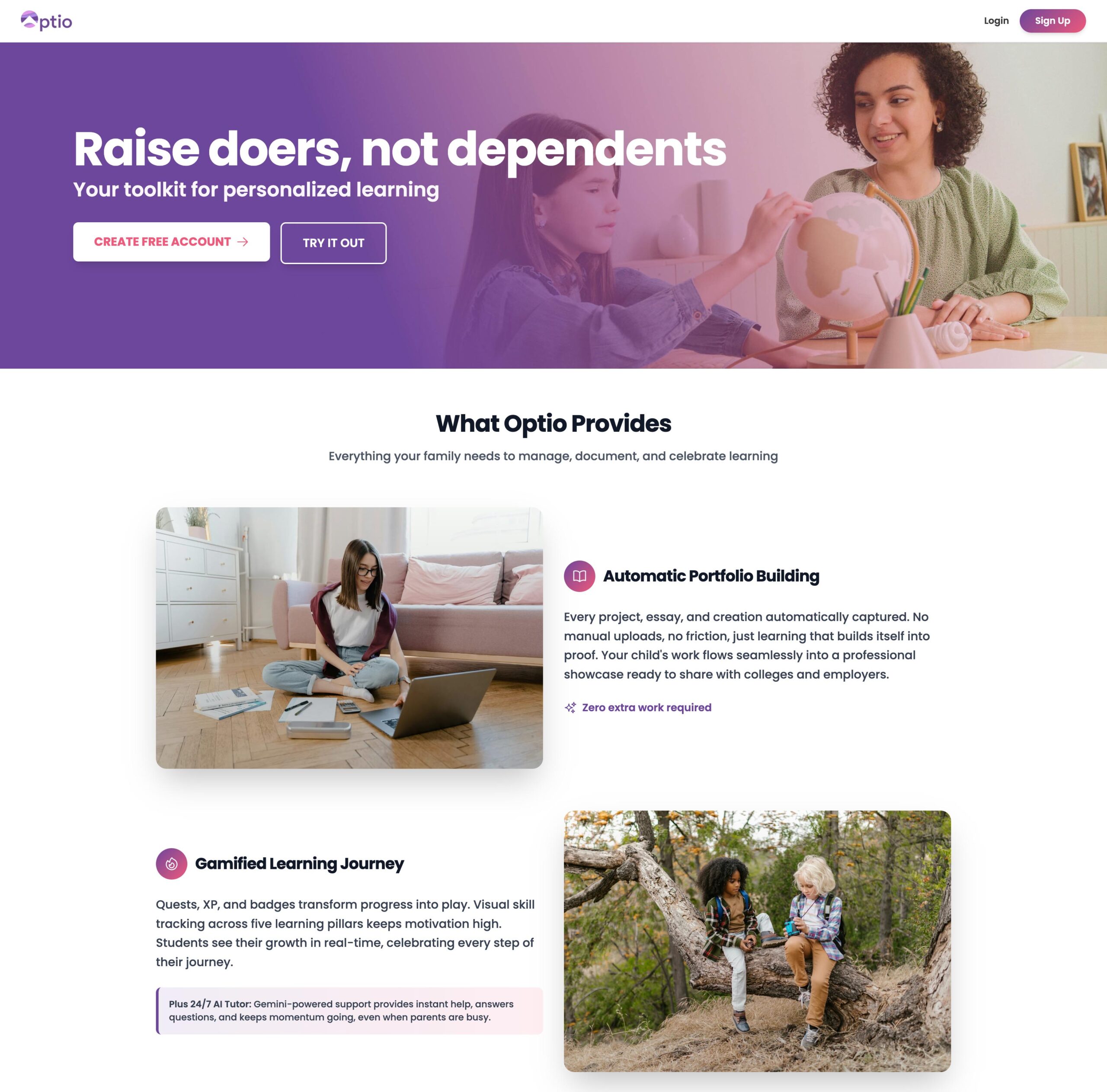
Interface Redesign
TIME TO COMPLETION: 2 months PAGES CREATED: 14 WORKING TIME: 25 billed hours
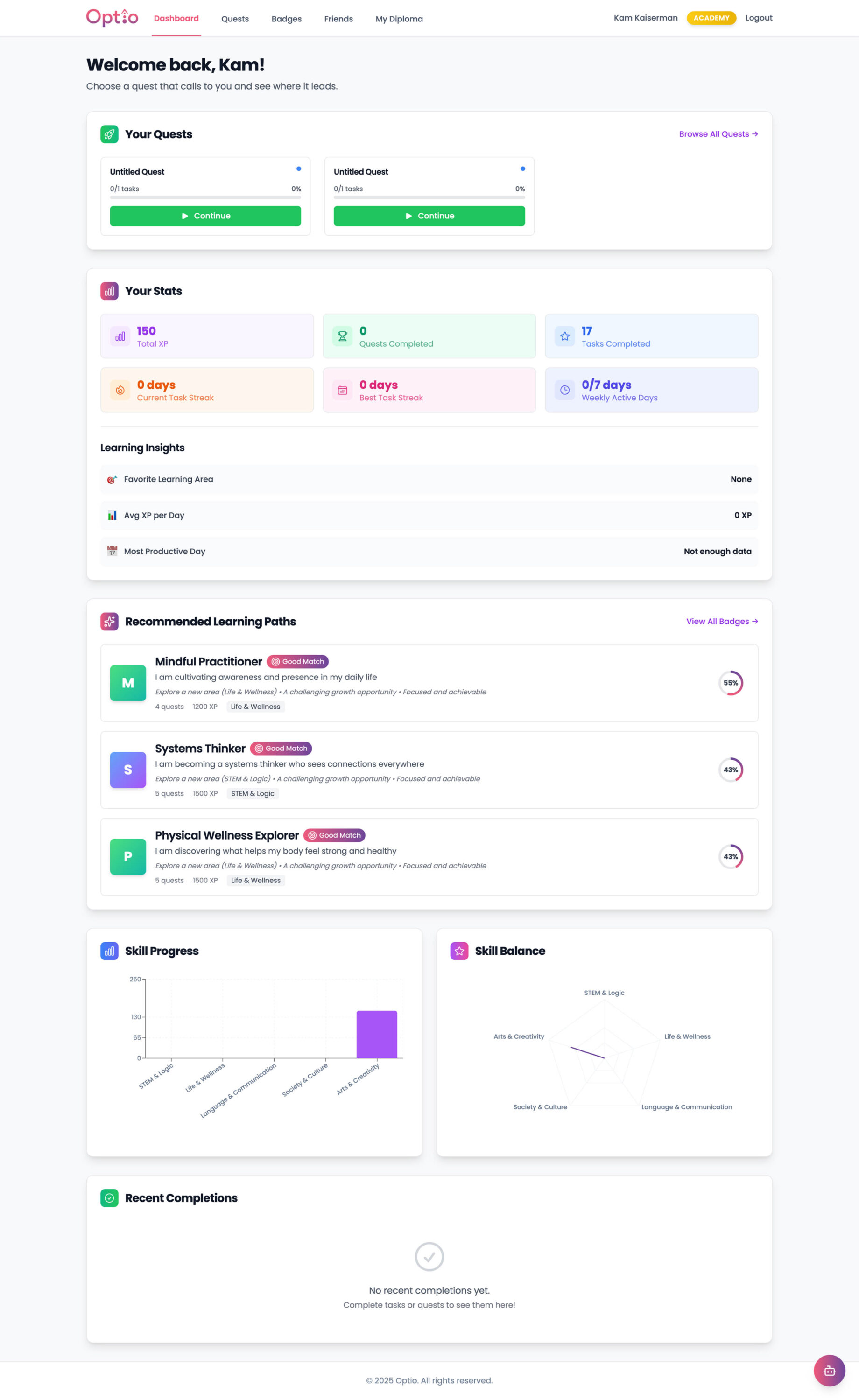
The original app design was made through Repilt.ai. Repilt, while creating a functioning product, lacked several organizational skills and created long, scroll heavy pages. My main goals were to reduce the scroll and create an interface that would give all essential information and tools above the fold.
First pass
With the introduction of side menus, separating appropriate information into separate pages, and ensuring students would always be shown their tasks and stats upon entering the interface, we were able to create a balanced, engaging product.
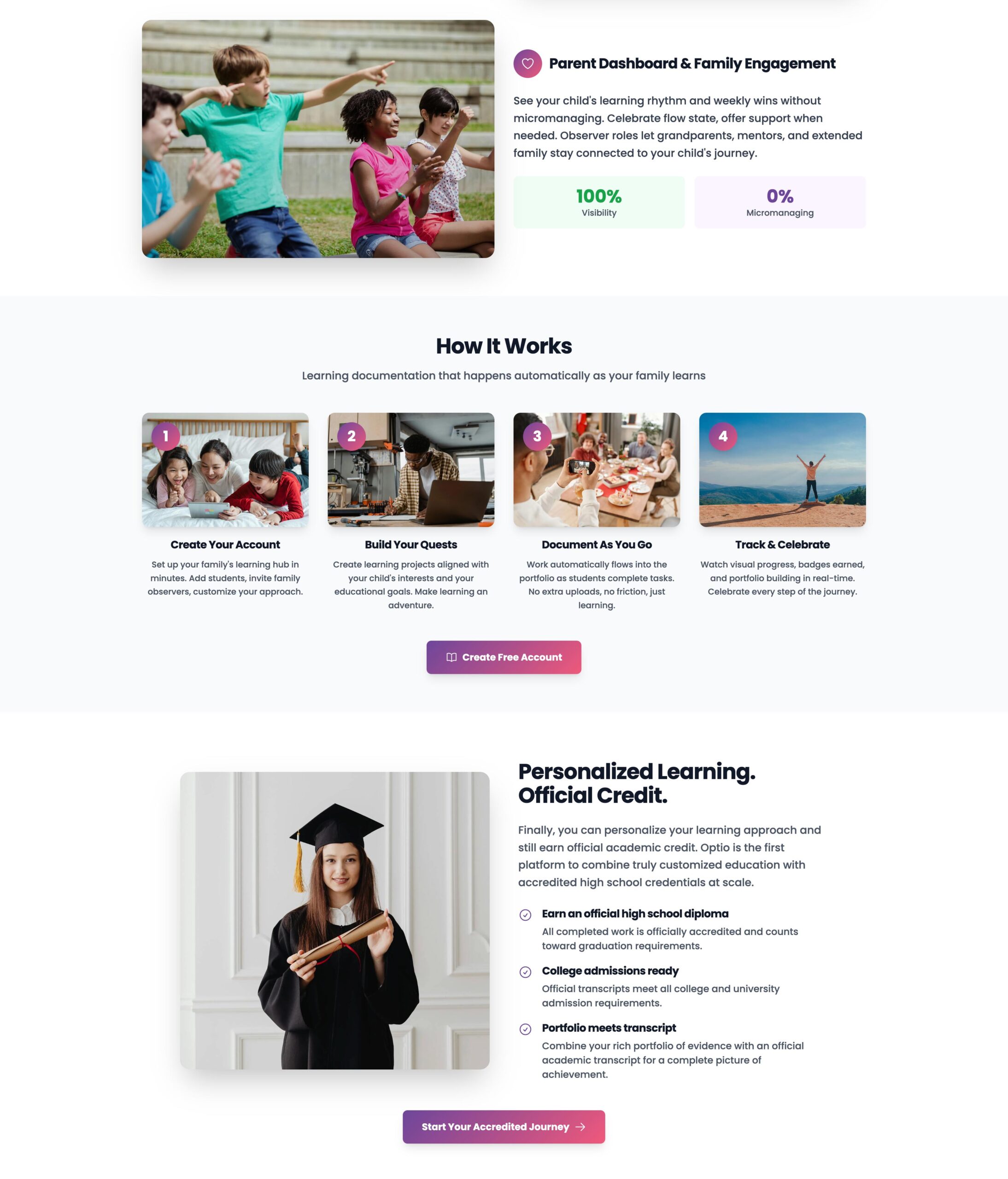
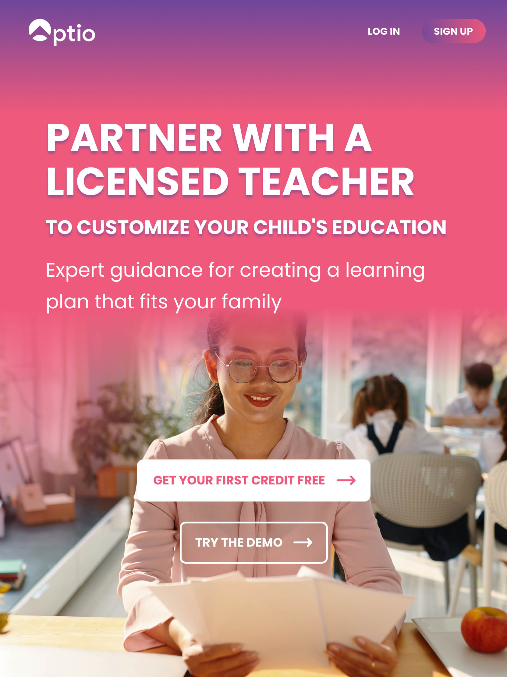
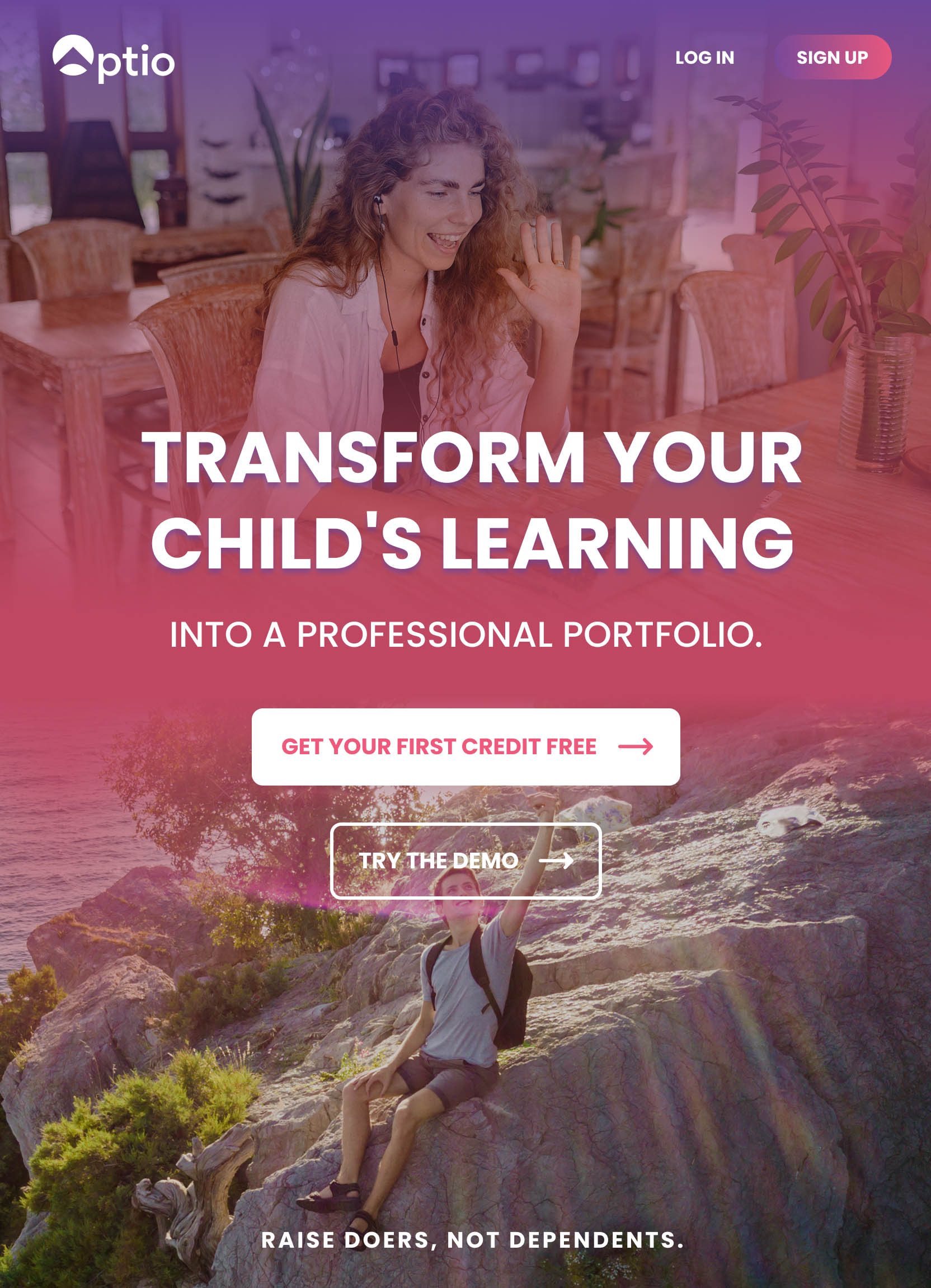
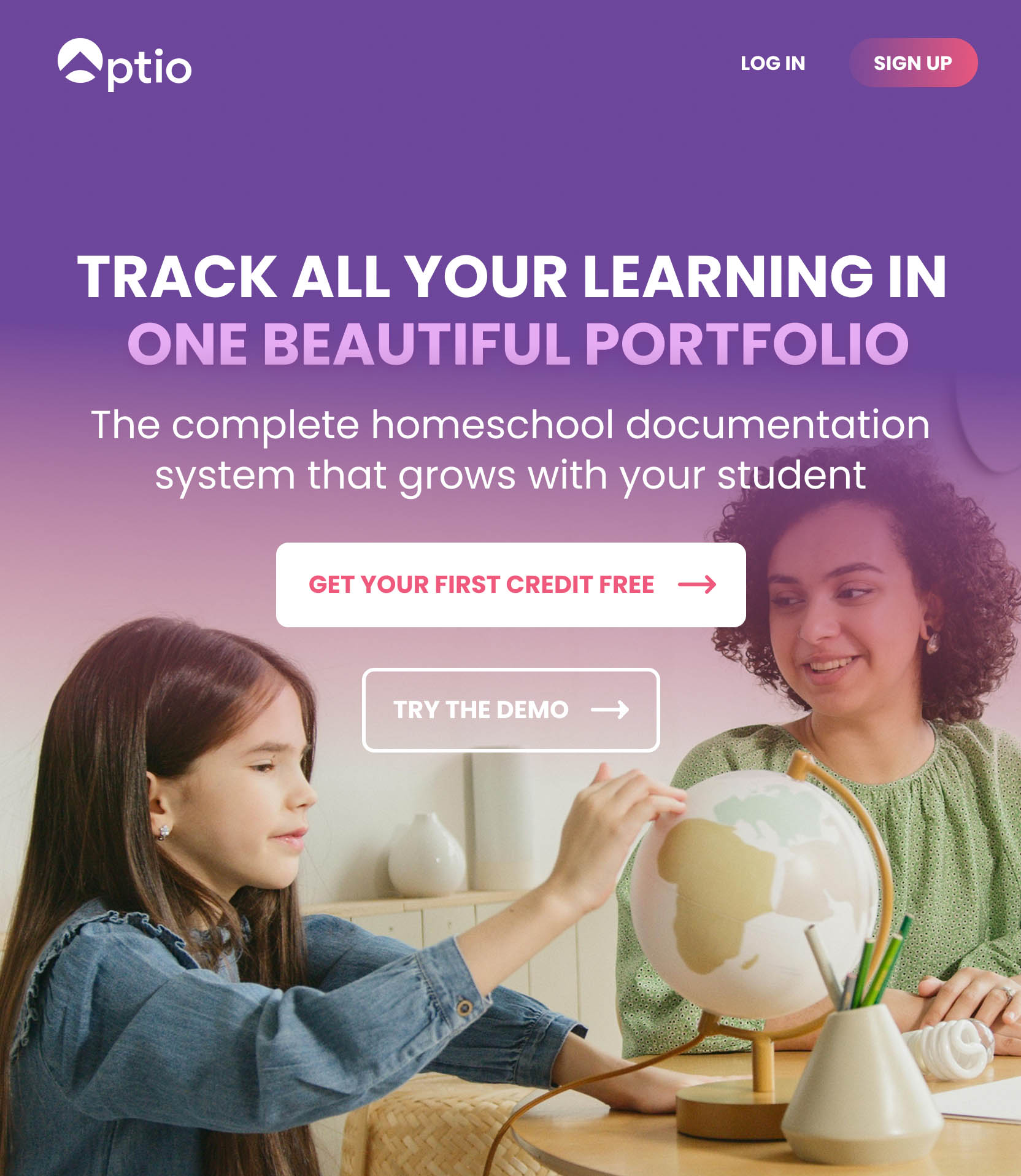
Landing Pages
Once the initial student interface was redesigned, we focused on several consumer landing pages that also had similar scroll heavy issues. My main recommendations, because of time constraints, were to refer back to the main customer profiles we had gathered, write to their 3 main concerns and pepper imagery throughout that evoked the meaning of the paired text while establishing meaningful CTAs (more than just “SIGN UP”) at the top, middle, and bottom of the page. I also reworked the color of headlines and type to increase legibility of all text and WCAG compliance.
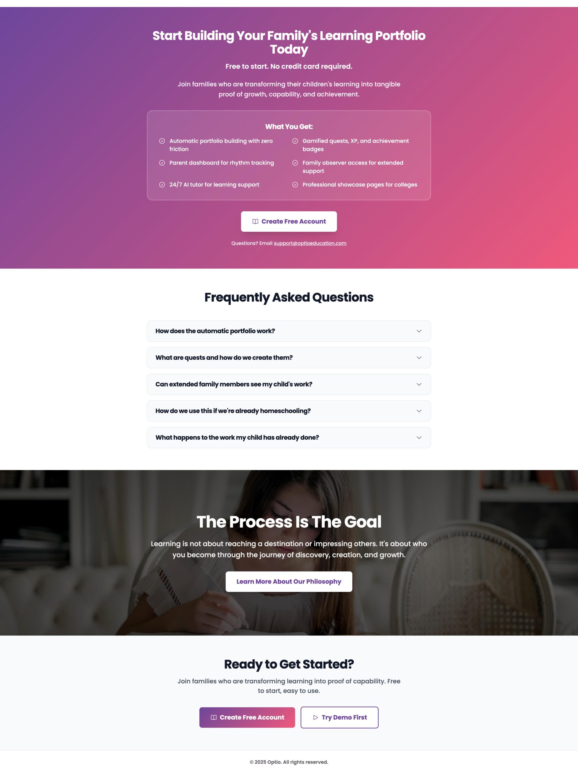
Redesigned pages and Headers
Optio was a wonderful project to work on. Not only did the founder and I find that I had known his family 15 years previous to our meeting, our communication was succinct and purposeful. Task management and requests were always given enough time to finish until completion. However, when rush requests eventually came in, we were able to find a balance between what was needed and what was possible, while still driving results.
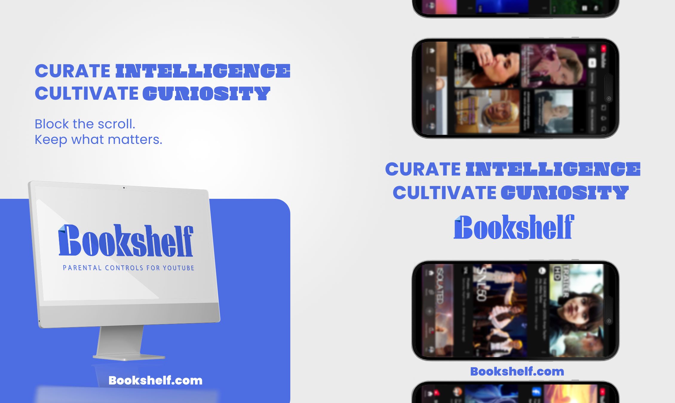
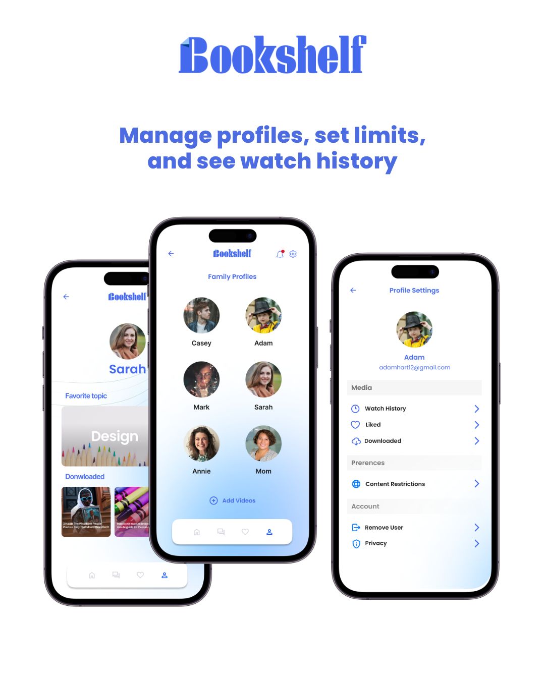
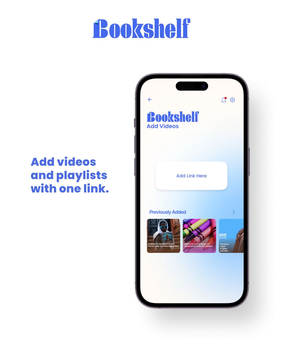
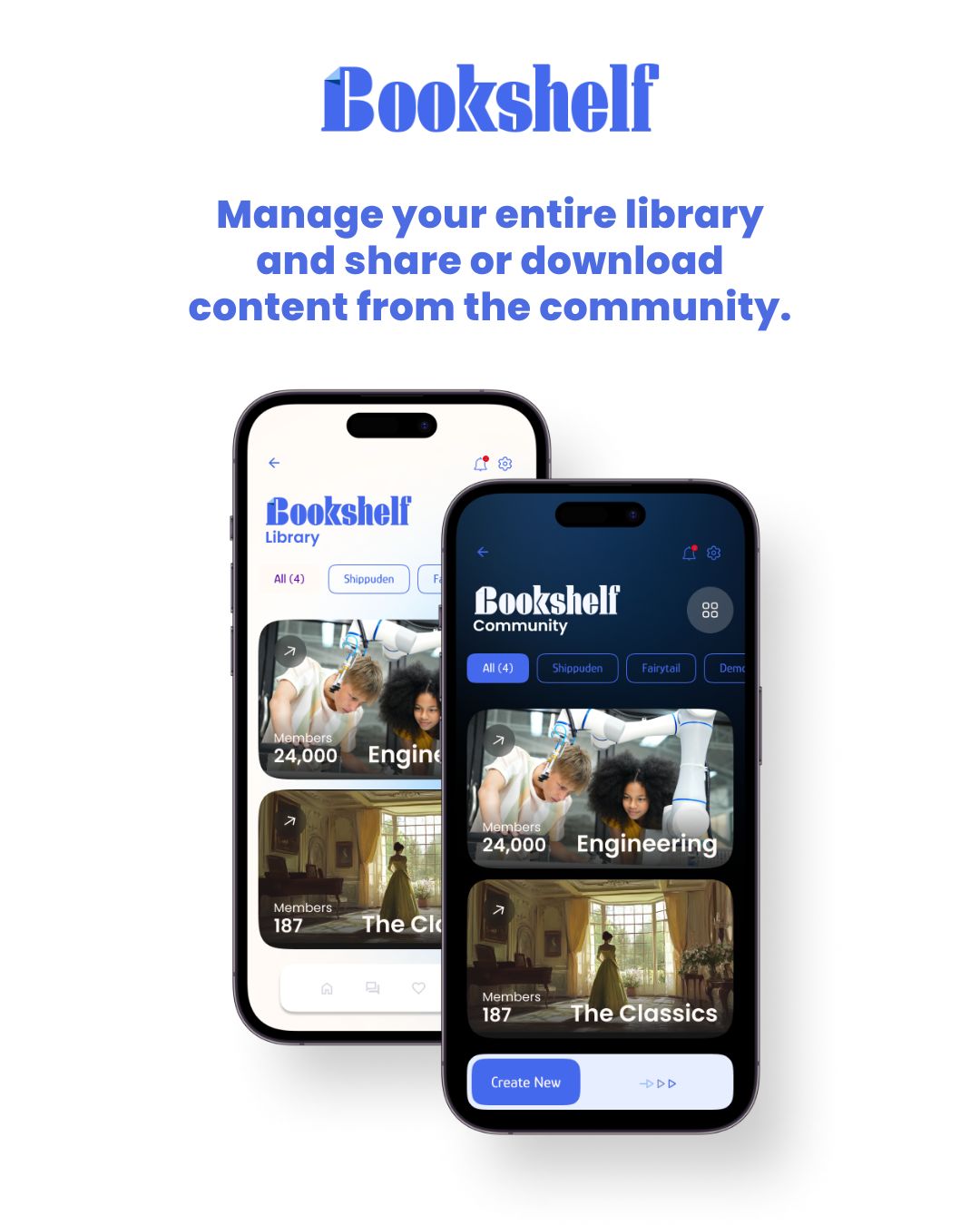
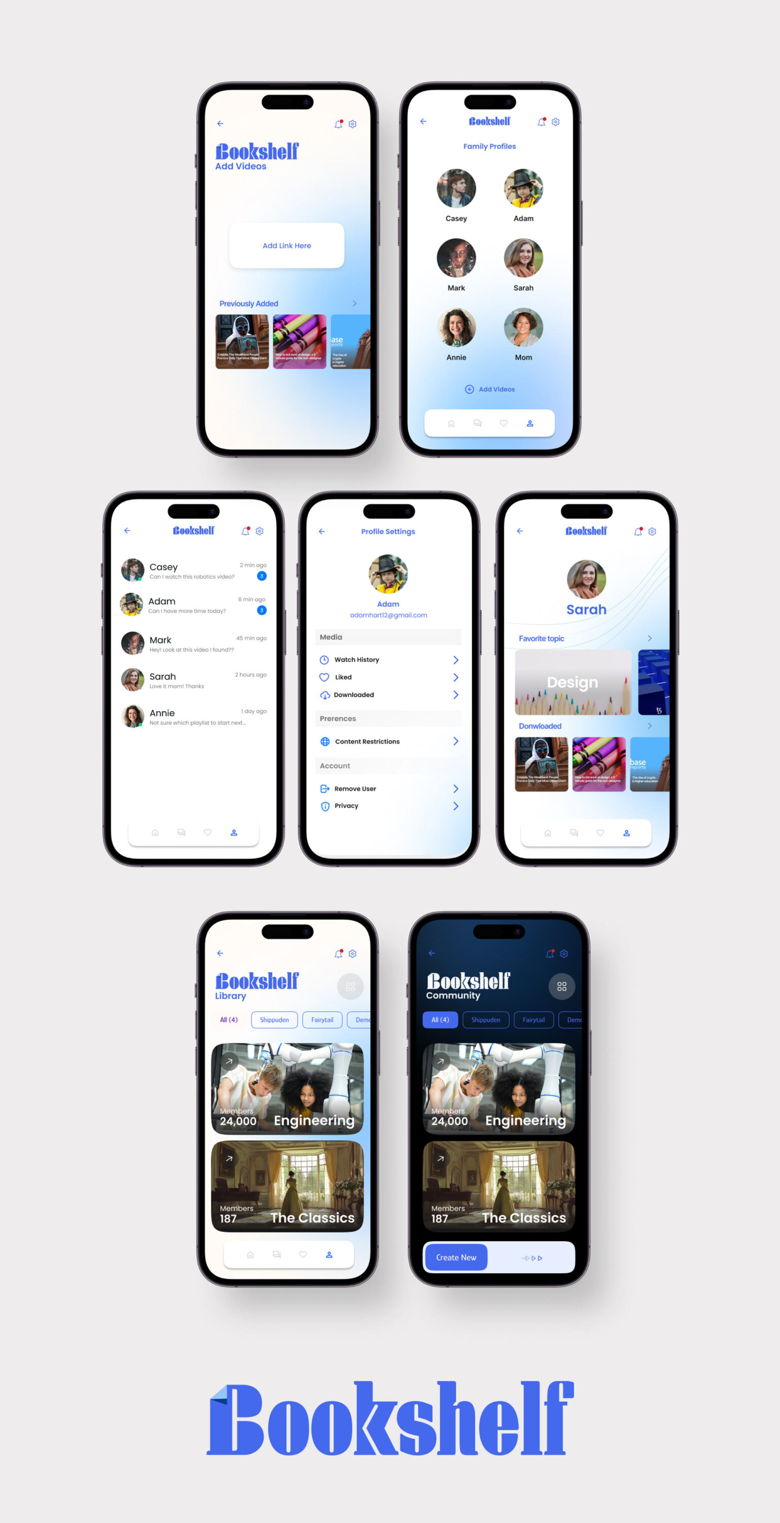
While contracting for the startup incubator Inception, I designed the app concept for Bookshelf, a video catalog and parental control platform. Bookshelf enables parents to create a permission hierarchy for their children, allowing access to curated video content from YouTube, Vimeo, and other sources while blocking inappropriate material. Additionally, it features a community page where parent admins can share and discover playlists, making it easy to expand each family’s video library with trusted recommendations.
SOCIAL MARKETING
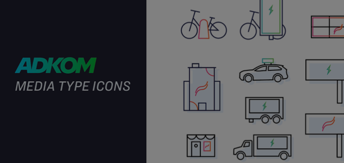
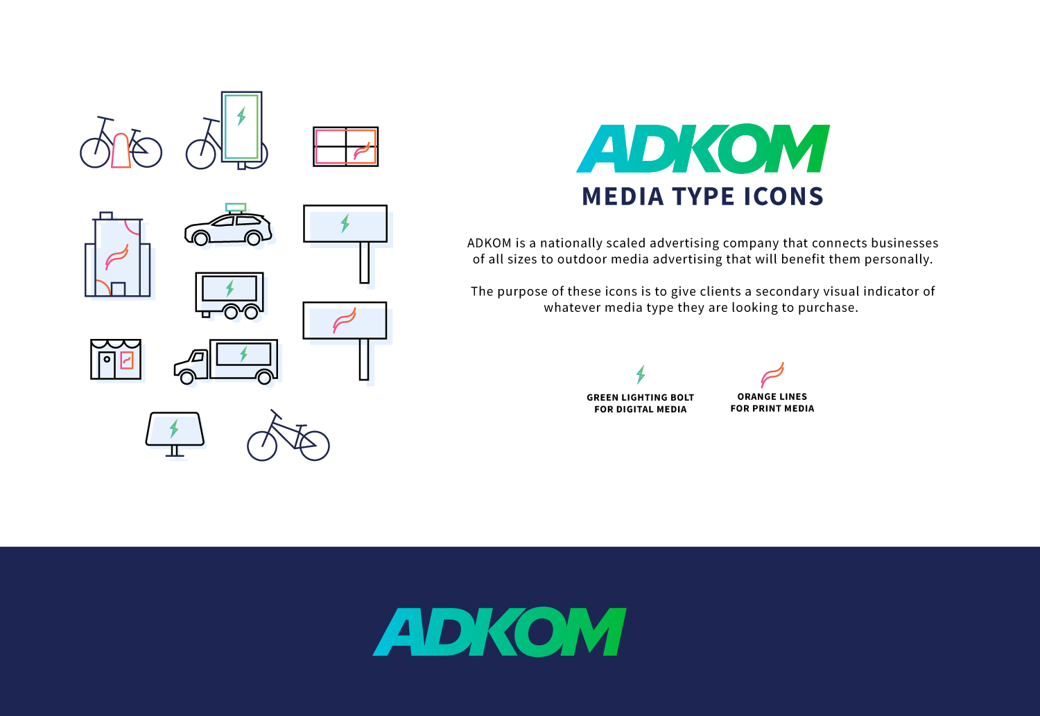
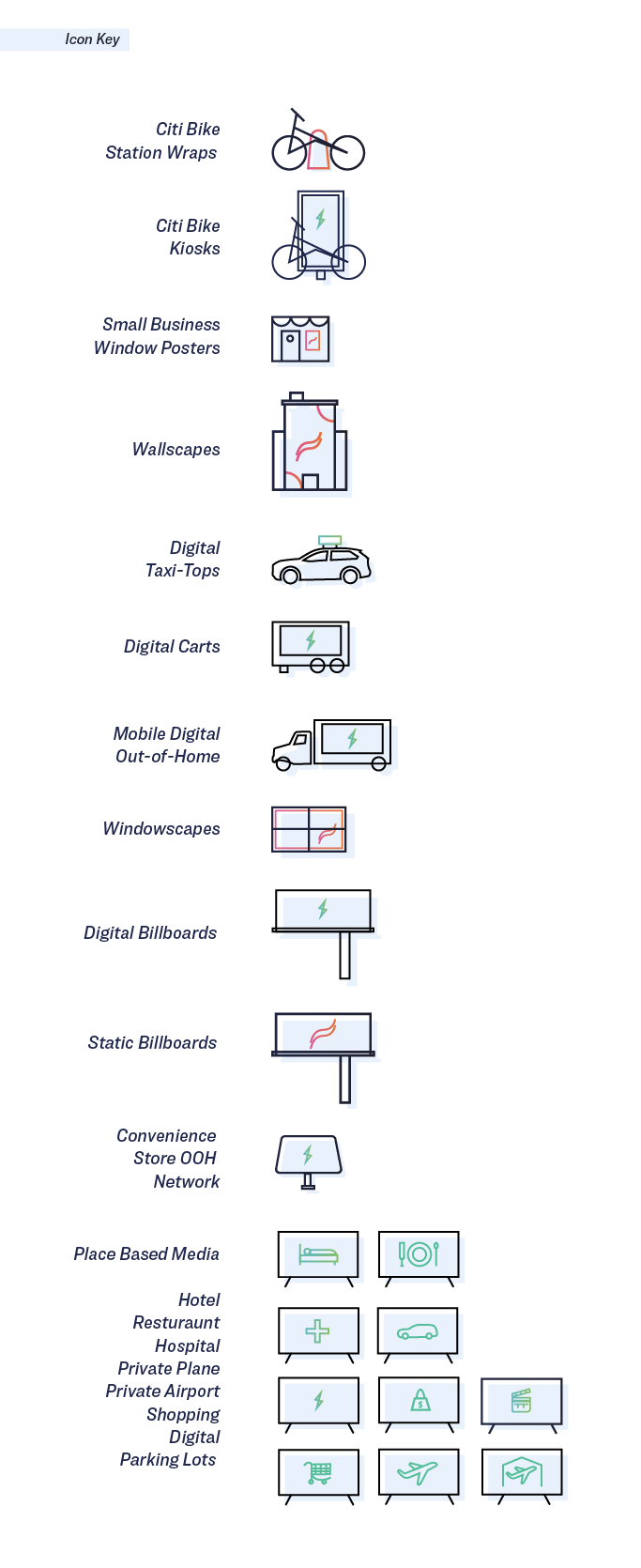
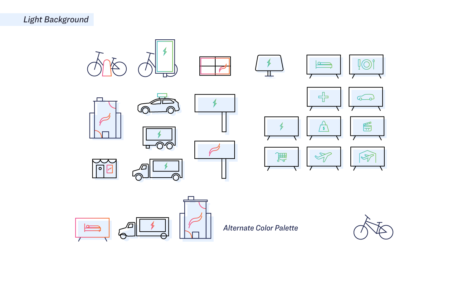
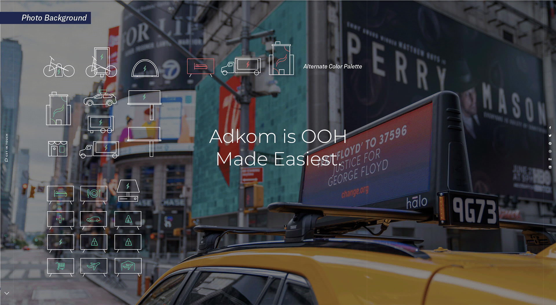
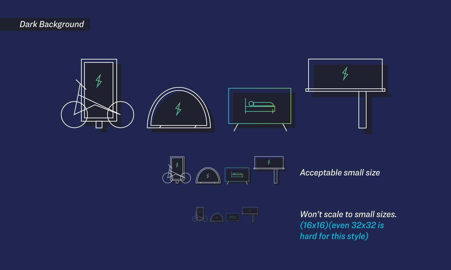
ADKOM - SPECIALTY ICON LIBRARY
ICON DESIGN
VISUAL DESIGN SYSTEMS
I developed the ADKOM icon library to create a cohesive visual system for the company’s extensive range of out-of-home (OOH) advertising platforms. The icons were organized into two distinct categories, electric and print. using a bold green lightning bolt for digital media and an orange swoosh for print formats. This visual identity made it easier for partners to quickly navigate ADKOM’s offerings and communicate options with clarity and consistency.
ICON DESIGN
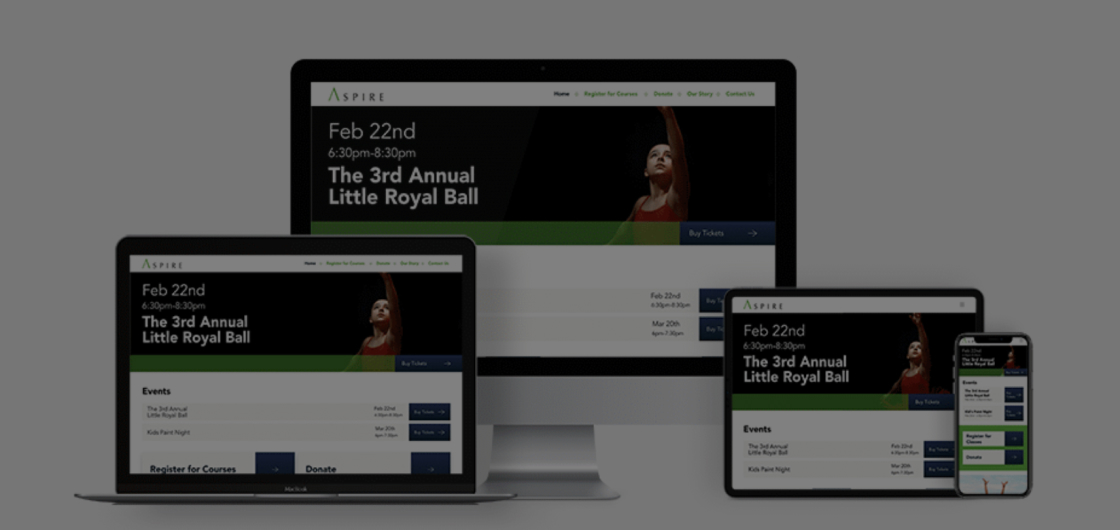
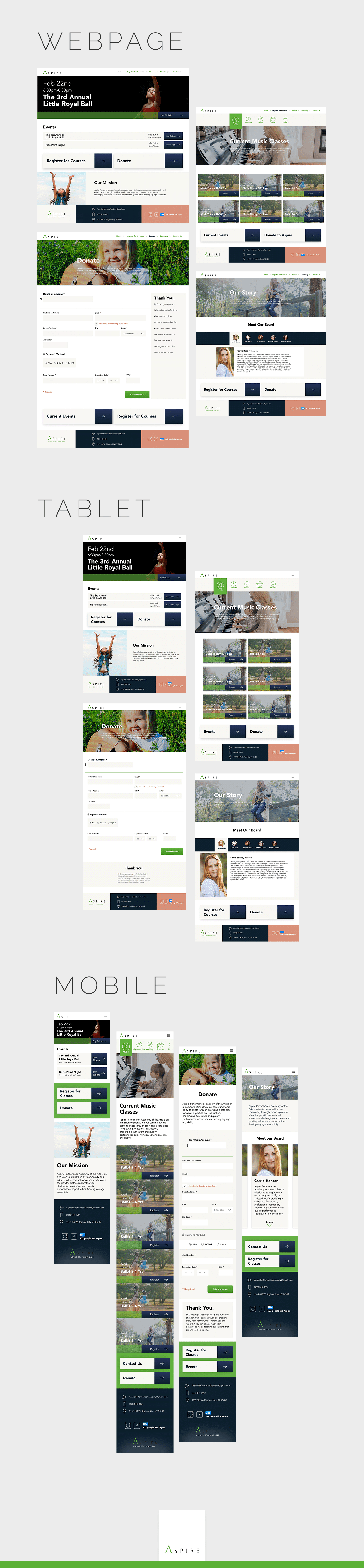
ASPIRE WEBSITE REDESIGN
MATERIAL DESIGN
CONCEPT WORK
RESPONSIVE DESIGN
VISUAL IDENTITY
UX/UI
UTAH VALLEY UNIVERSITY
As part of an undergraduate design project, I created a fully responsive website for Aspire, a local nonprofit dance studio that teaches children Jazz, Contemporary, Ballet, and Hip Hop. Though the project was a conceptual redesign, it followed Google’s Material Design system to ensure a clean, intuitive interface across desktop, tablet, and mobile devices. Special attention was given to accessibility standards and legal compliance, making the design inclusive and aligned with real-world usability requirements.
WEBSITE
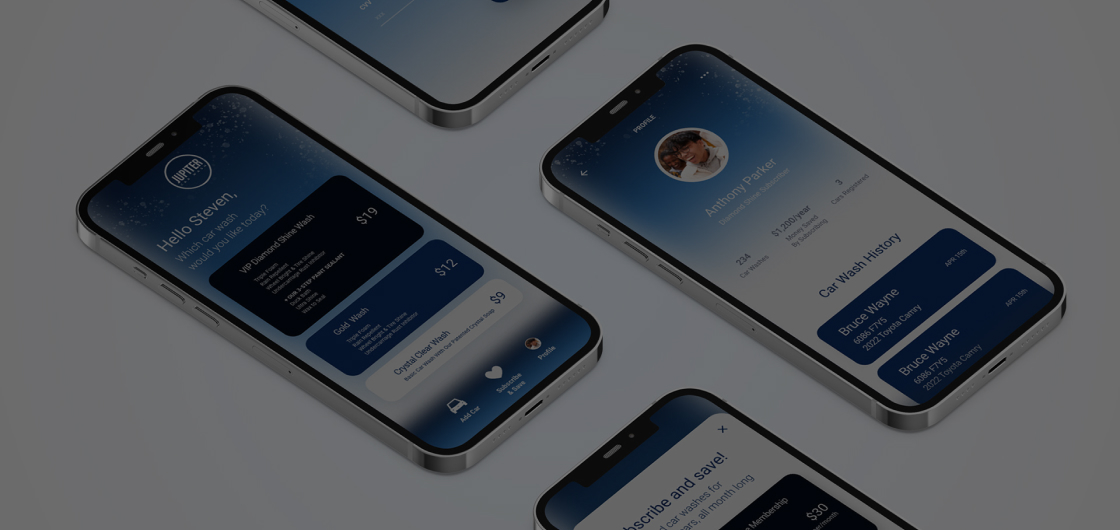
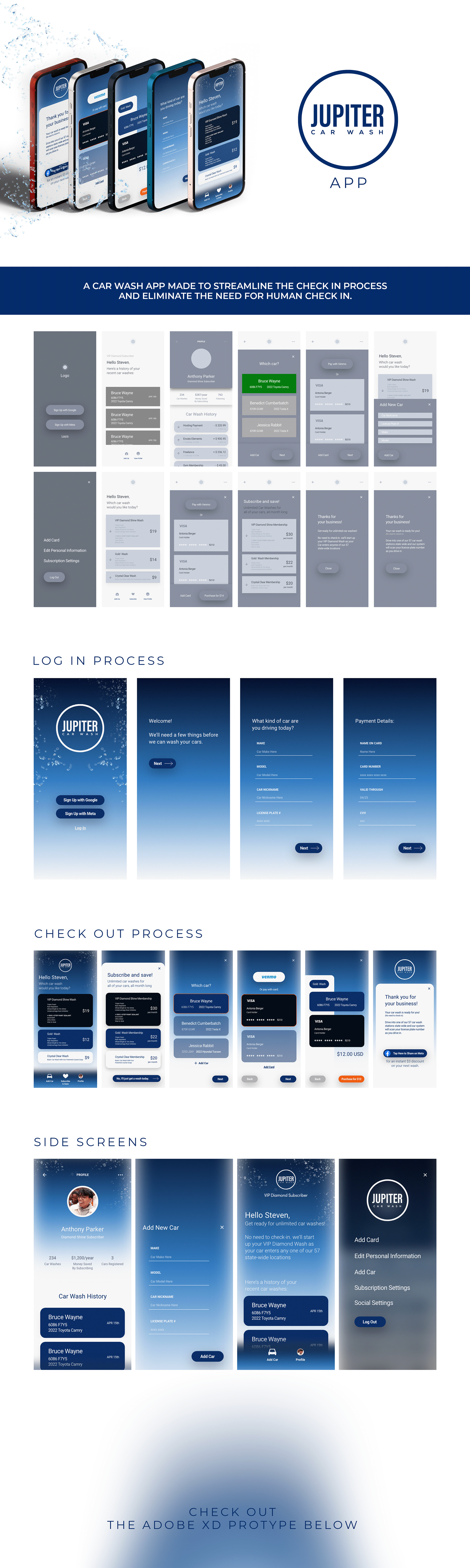
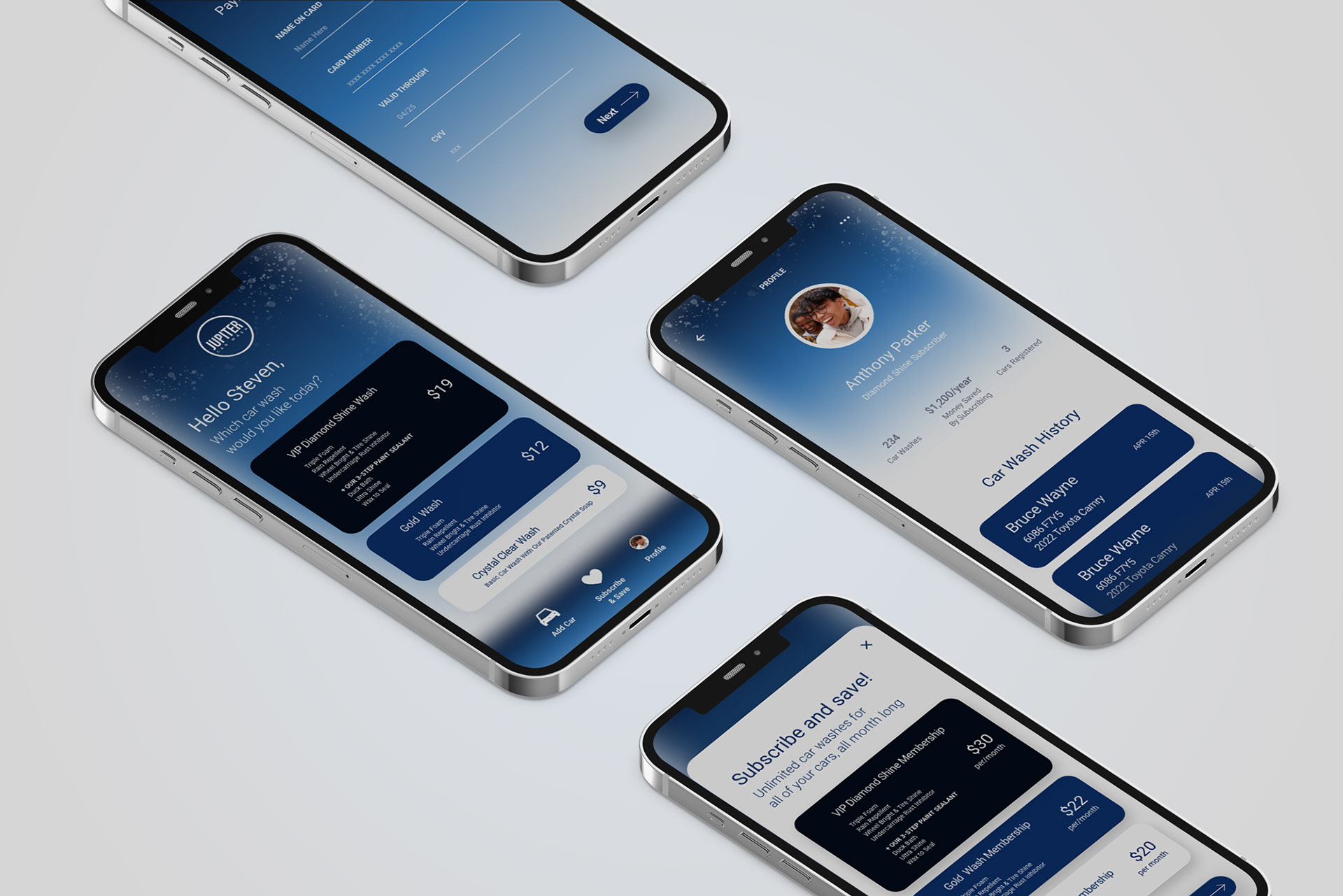
JUPITER CAR WASH: CHECK-IN APP
APP DESIGN
APP DESIGN
VISUAL IDENTITY
UX/UI
UTAH VALLEY UNIVERSITY
UNDERGRAD CONCEPT WORK
I designed the prototype for Jupiter Car Wash, an unreleased instant check-in app focused on streamlining the user experience from arrival to wash completion. Built in Adobe XD, the design prioritized clean user flows, a strong and consistent visual identity, and effortless navigation. The goal was to make the check-in process as intuitive as possible, combining bold branding with functional simplicity to ensure a smooth experience for every user.
APP PROTOTYPE
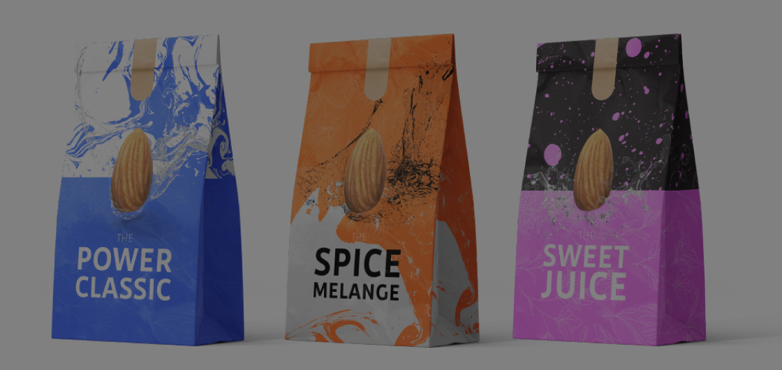
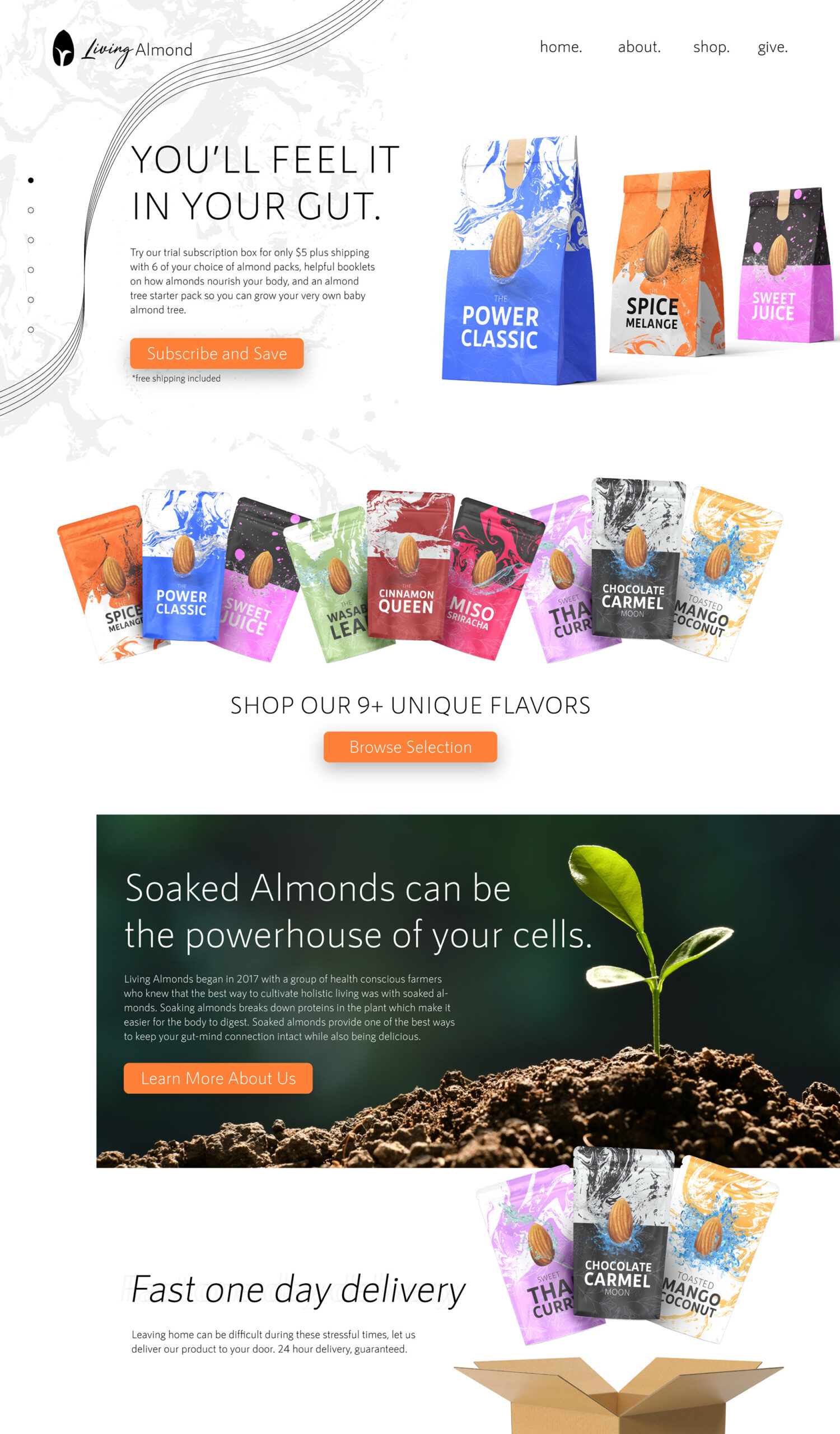
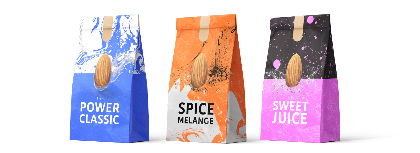
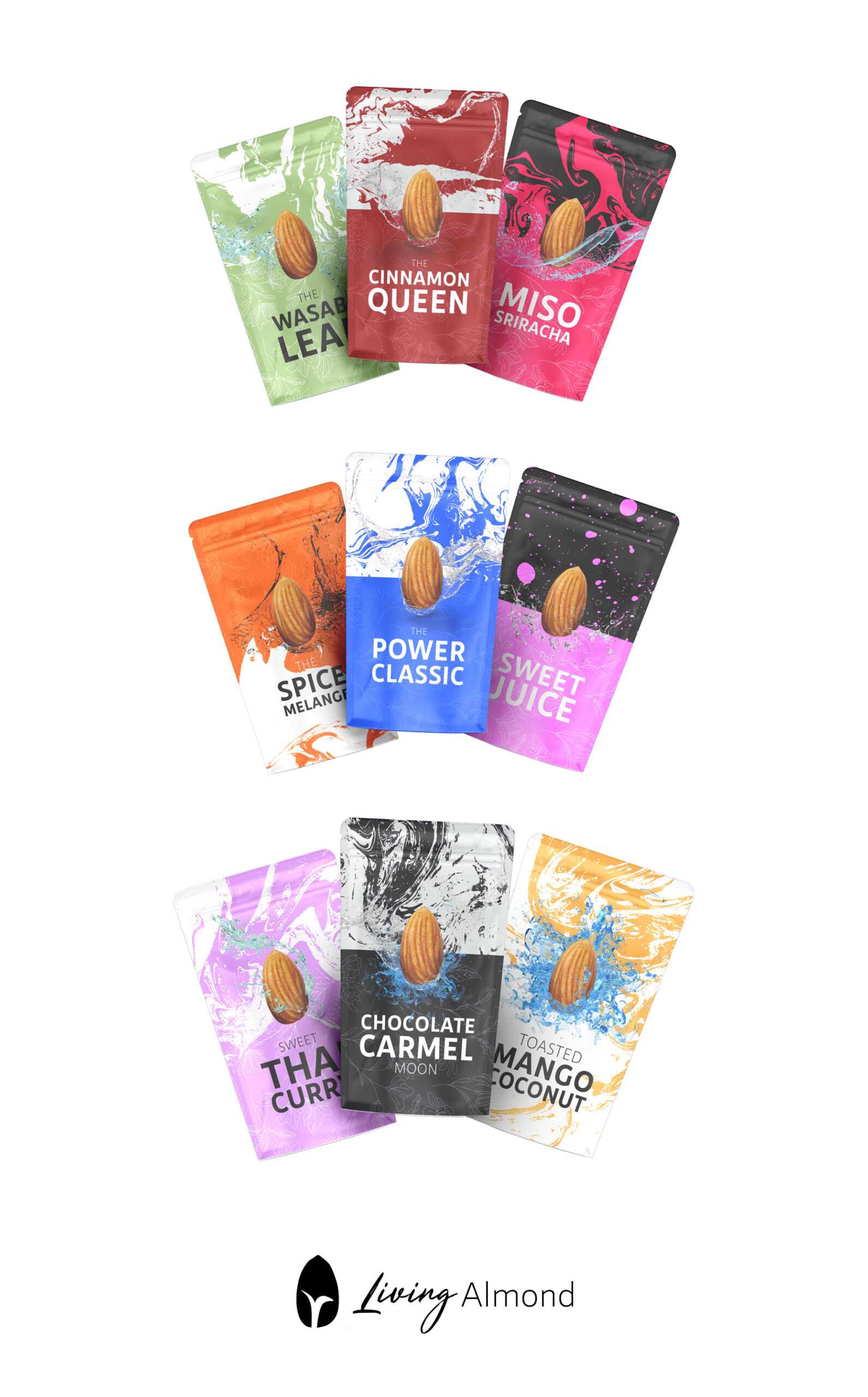
LIVING ALMONDS
CONCEPT
BRANDING
VISUAL IDENTITY
FOOD PACKAGING
Living Almonds was a personal passion project focused on creating a clean, environmentally friendly line of flavored and spiced almonds. I developed the full concept design, including the logo, website, and packaging for a variety of globally inspired flavors like “Miso Sriracha,” “Thai Curry,” and “Mango Coconut.” One standout flavor, “The Spice Melange,” paid homage to the Dune series with a sci-fi twist. The branding emphasized natural ingredients, sustainability, and bold, adventurous flavor profiles, combining visual storytelling with mindful design.