
Jan 5th, 2025, by Kam Kaiserman
How AI Is Accelerating Logo Design
A practical guide to a new design workflow that can empower designers to accomplish what once required entire departments.
The Capacity Revolution: From Tool To Collaborator
Designers are experiencing a fundamental shift with AI. As I’ve discussed with friends and colleagues, it’s been clear their fear of being replaced or the pressure to create faster, better, stronger is consistent across industries and individuals, all hoping to maintain positions in their industry but lacking the technical knowledge to stay relevant. Designers must keep up with AI developments but we’re caught in a sea of new programs and increasing demands, unsure which programs to pick and how to adapt our workflows.
However, instead of replacing designers, correct AI use is showcasing that both high level designers and small teams can accomplish what once required entire departments. The real advantage lies in understanding how to integrate AI programs strategically into personal creative workflows. This shift represents a mindset shift from “AI can make images” or even “AI will replace me” to “AI can extend my creative reach across every phase of the design process.”
With AI integration, that same designer who now spends three weeks exploring thirty concepts can expand their work to only curation and refinement by having AI handle the grunt work for most jobs while designers add the human touch. As of Jan 2026, AI can successfully generate rough drafts of logos, organize file structures, and handle the initial prototyping of websites and apps, as well as many developments to come.
As designers stay updated on the rapid changes of AI tech, they can continue to streamline their process with minimal training.
Rapid Concepting and Mood Boards
Designers are using AI to generate dozens of visual directions in minutes. While the results are often haphazard, “rolling the dice” as AI users have coined, knowing how to speak to AI is all that’s needed to generate the beginning stages of a design.
At Zion Forge, we needed to prototype the logo for Maverick, an airsoft ammo company. We began by pitching ideas and general directions whether that be a logo made of lines, geometric designs, a bird or bull icon, or a letterform. I then took those prompts into Midjourney and generated the following results.
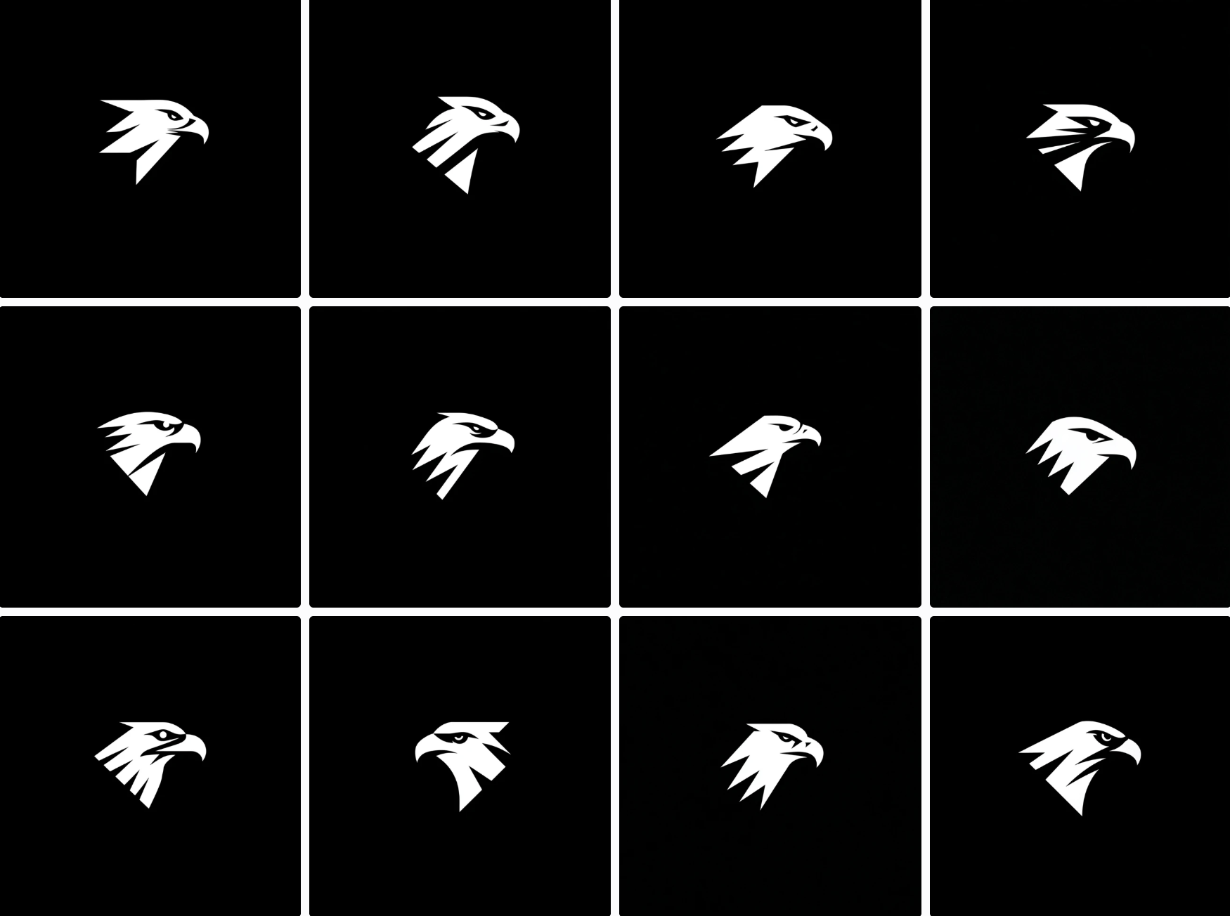
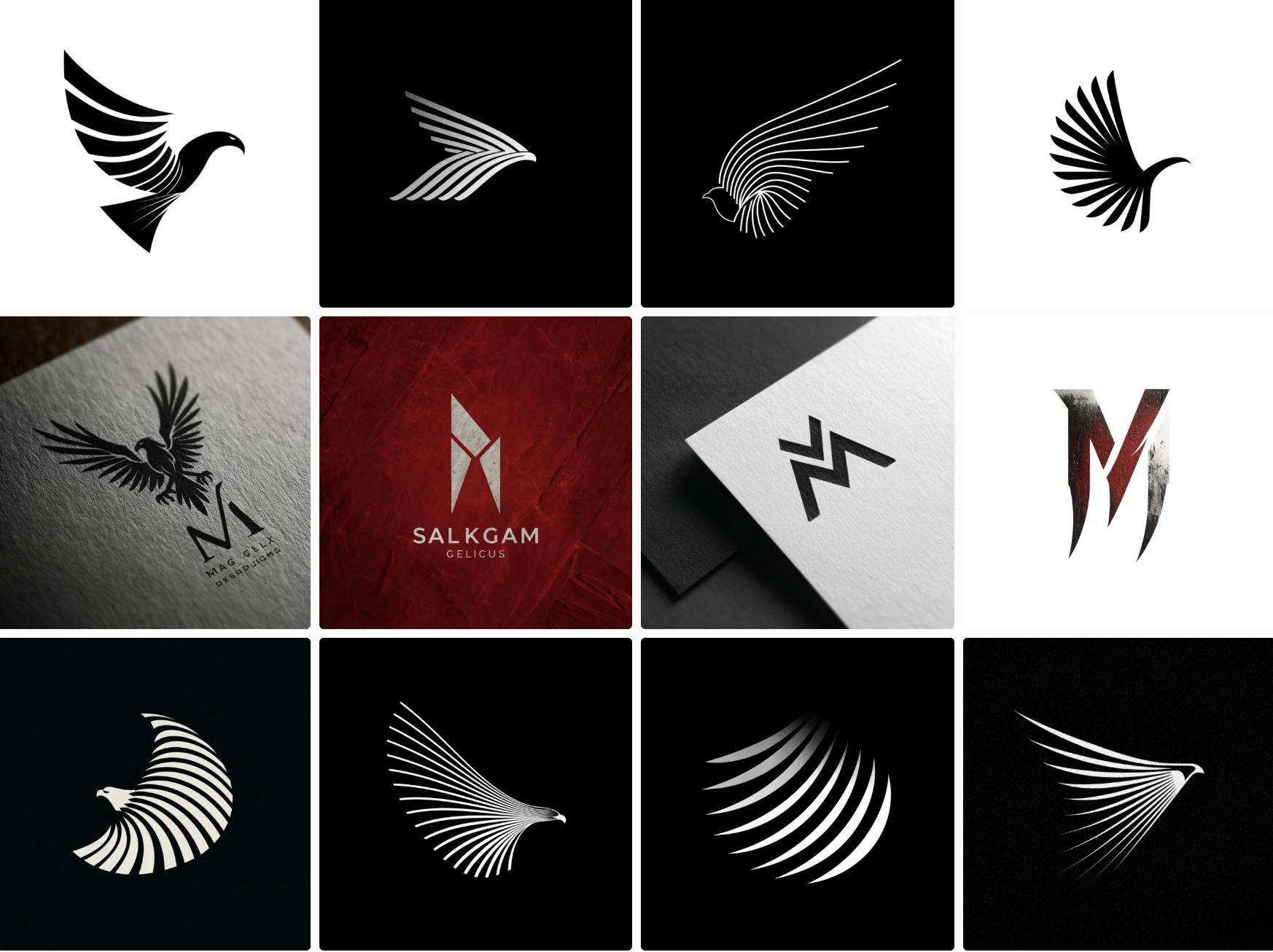
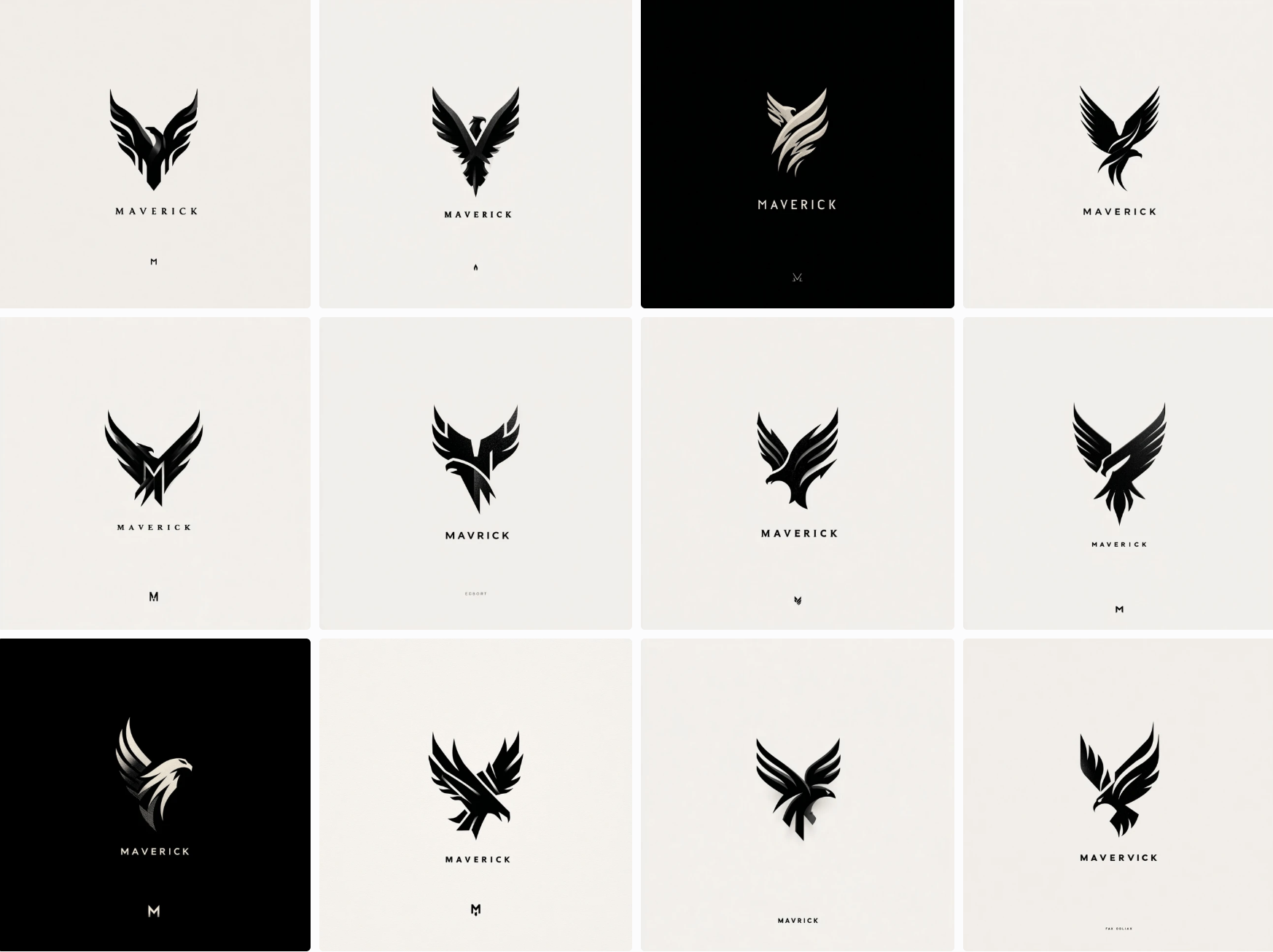
During the prototyping stage, we generated over 500 concepts within two hours but many were too complex or the theming was off. Often, designs were stale or similarly corporate in style. But with so many concept directions, we were able to accelerate internal discussions and establish a general direction for the project with stakeholders, quickly moving the process to the refinement stage in days instead of weeks.
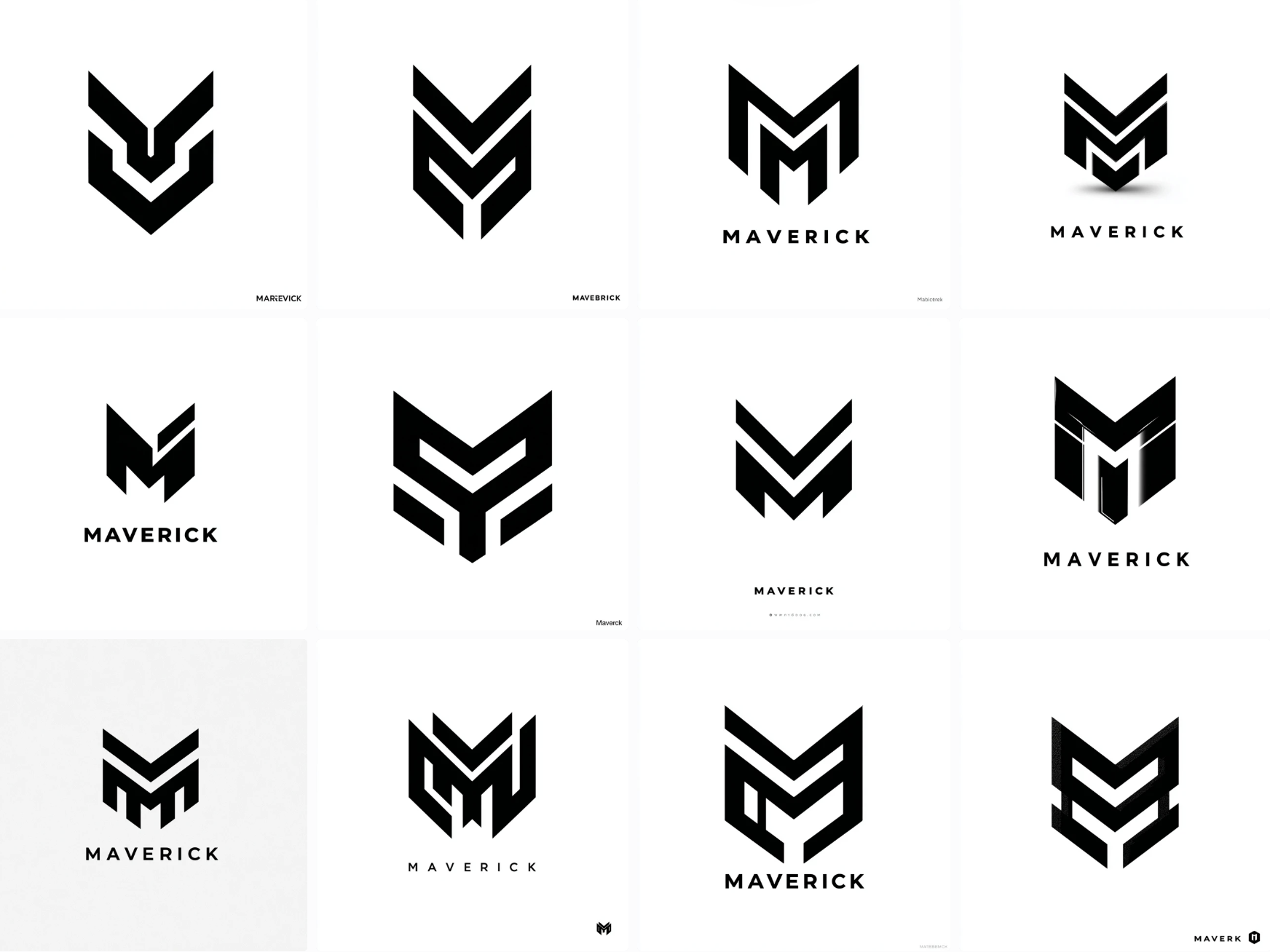
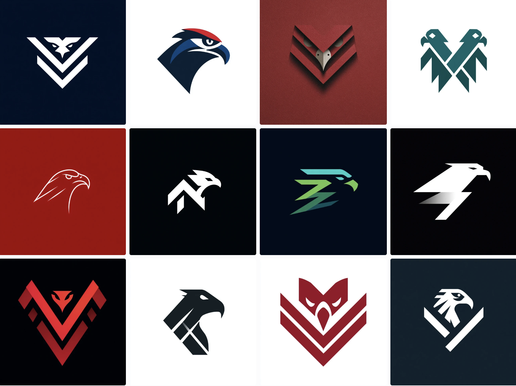
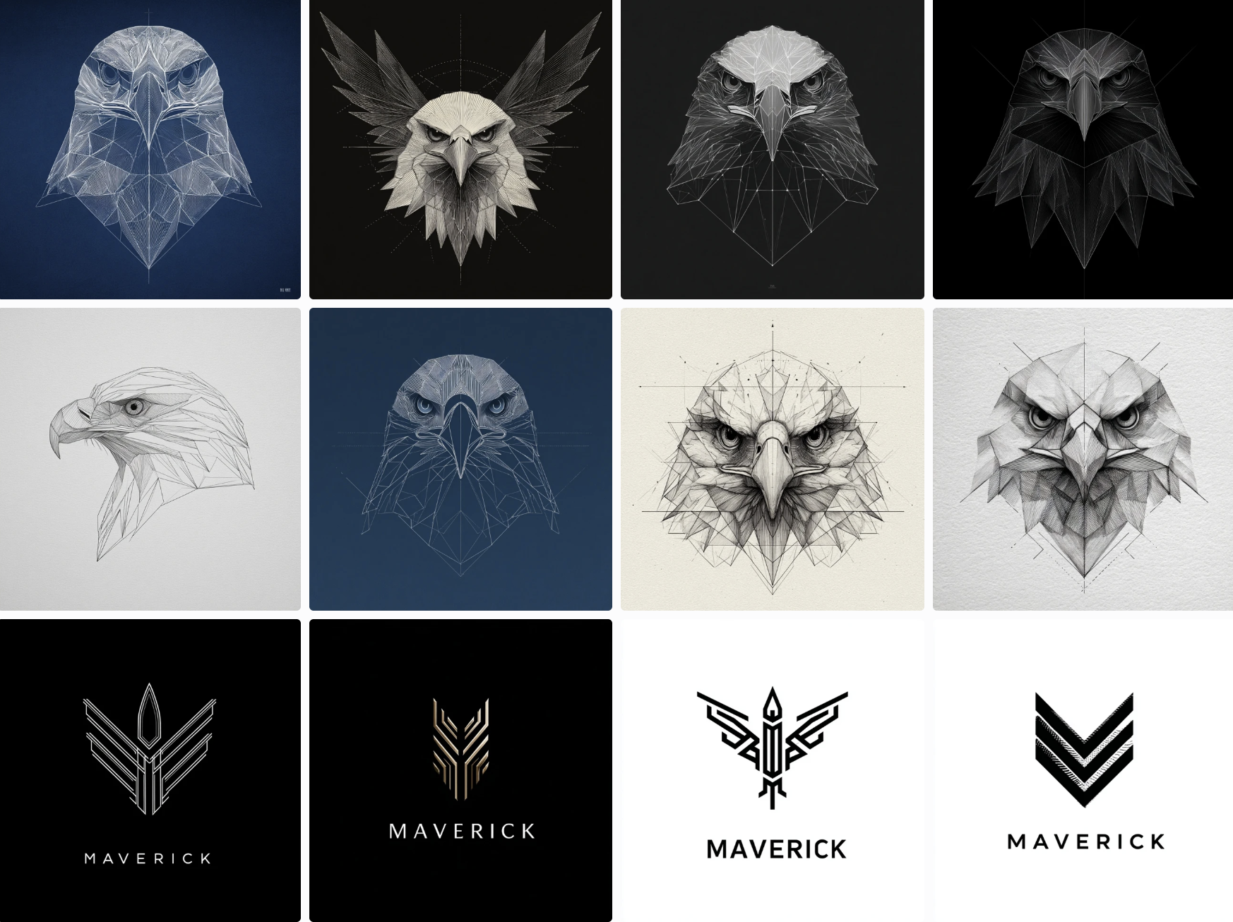
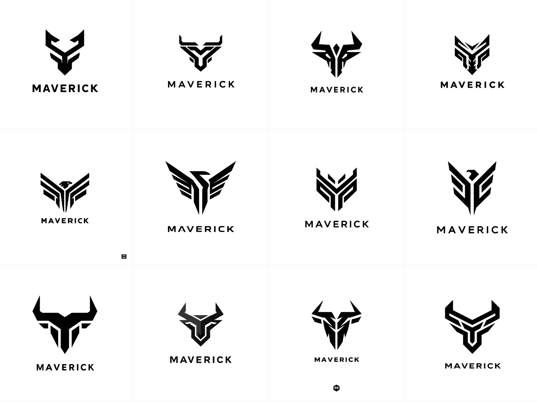
After a stakeholder meeting we were able to showcase the 11 best concepts and then selected the bird designs to refine.
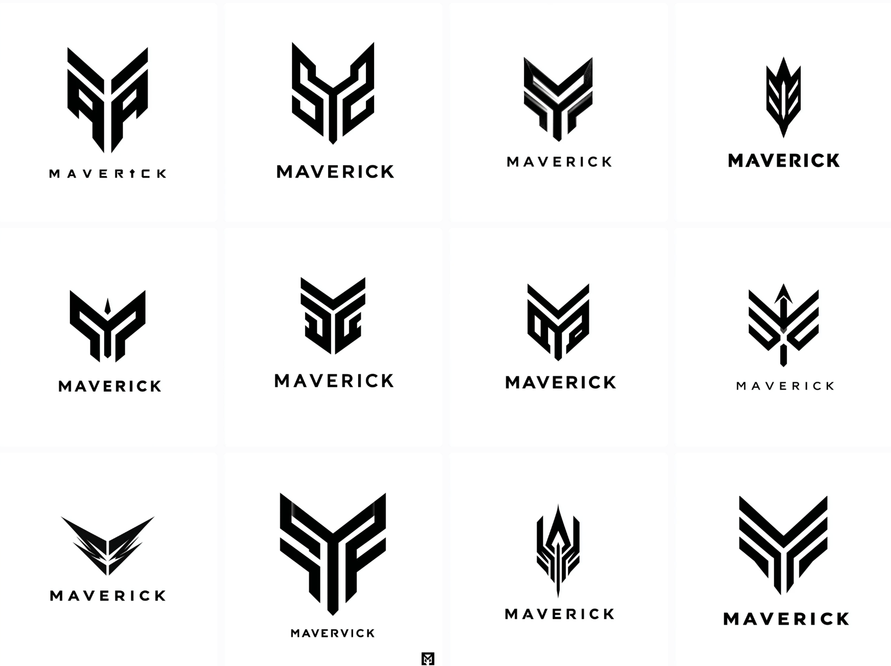
After an hour or so of refinement we finalized an eagle logo design that was composed of one structured outline with added type for the company name.
Final Maverick Design

Limitations & The Grit
A few issues designers might run into could be:
- Understanding prompts and what AI can actually achieve.
- Drowning in the endless options (losing instead of gaining back time)
- Using AI tools but failing to select the best tool for their task.
AI can be useful for general logos, but it consistently fails to comprehend complex concepts through prompting like a negative space logo with multiple meanings. It also struggles with typography and can’t utilize established fonts. ChatGPT and similar chatbots often fail at image generation tasks or create muddy or inaccurate designs. The most accessible, ready made tool for image generation today is Midjourney.
Copyright issues may arise as new regulations are passed across the world and it remains vital to only use AI for concept generation that can then be adapted enough to curb any infringement concerns.
My stack currently consists of:
- Working with Claude.AI and ChatGPT to generate a prompt
- Selecting a generated prompt for Midjourney
- Generating options with Midjourney
- Taking the best options into Adobe programs for refinement
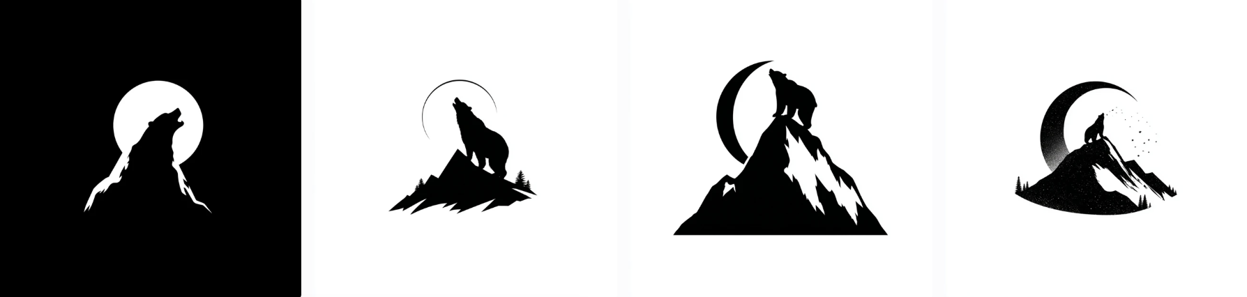
A logo design of a silhouette of a mountain peak with a negative space bear looking up at the moon, professional graphic design, vector, black and white color.
The above handwritten prompt generated mediocre results. The bear is only in negative space in one option and blends poorly into the mountain outline. After asking Claude.AI to create prompts for Midjourney based on my original, it generated the following prompt,
“negative space logo design, mountain peak silhouette with bear looking up at moon hidden in negative space, minimalist, professional graphic design, vector art style, black and white, clean lines, clever use of negative space, flat design, simple shapes, corporate branding style”
After two attempts or “rolls”, Midjourney began to generate concepts that included some negative space but were often too complicated and needed to be simplified or multiple concepts combined by a human.
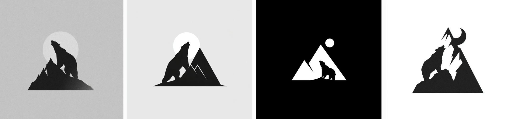
Although you can keep refining prompts, there’s no way to tell how long it may take to achieve the exact desired results. For now, these more complex concepts are best left to the human hand.
——–
Though we don’t know what AI will actually achieve in the coming years, for now, only specific, generalist tasks are helped through AI use. While your typical start-up may be vastly accelerated and use designs straight from AI, larger companies can still benefit from the rapid prototyping process to ensure team alignment. Through rapid prototyping and idea generation, human designers can take those generated prototypes and give clarity to their teams and stakeholders.
Recent Contracts
KOTA SOLAR
AI
WEB APP
DESIGN SYSTEMS
RUCK DELIVERY
CONTRACT
UX/UI
HIGH OUTPUT
OPTIO
BRANDING
UX/UI
HIGH OUTPUT
ZION FORGE
DESIGN
WEB AND APP DEV
MARKETING
PAST PROJECTS (Pre-2025)
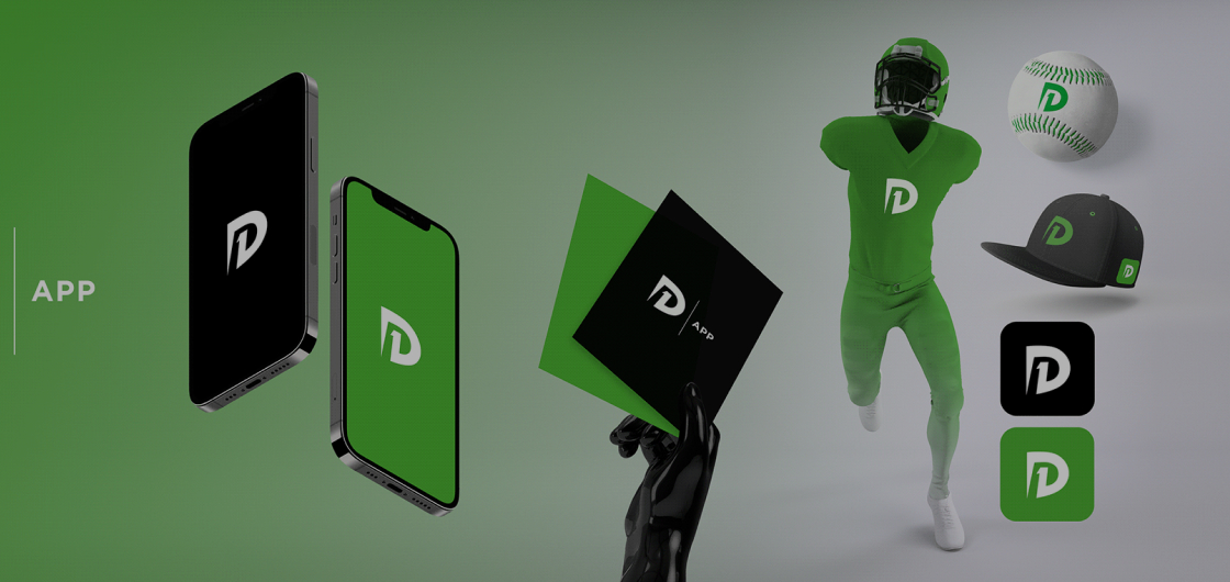
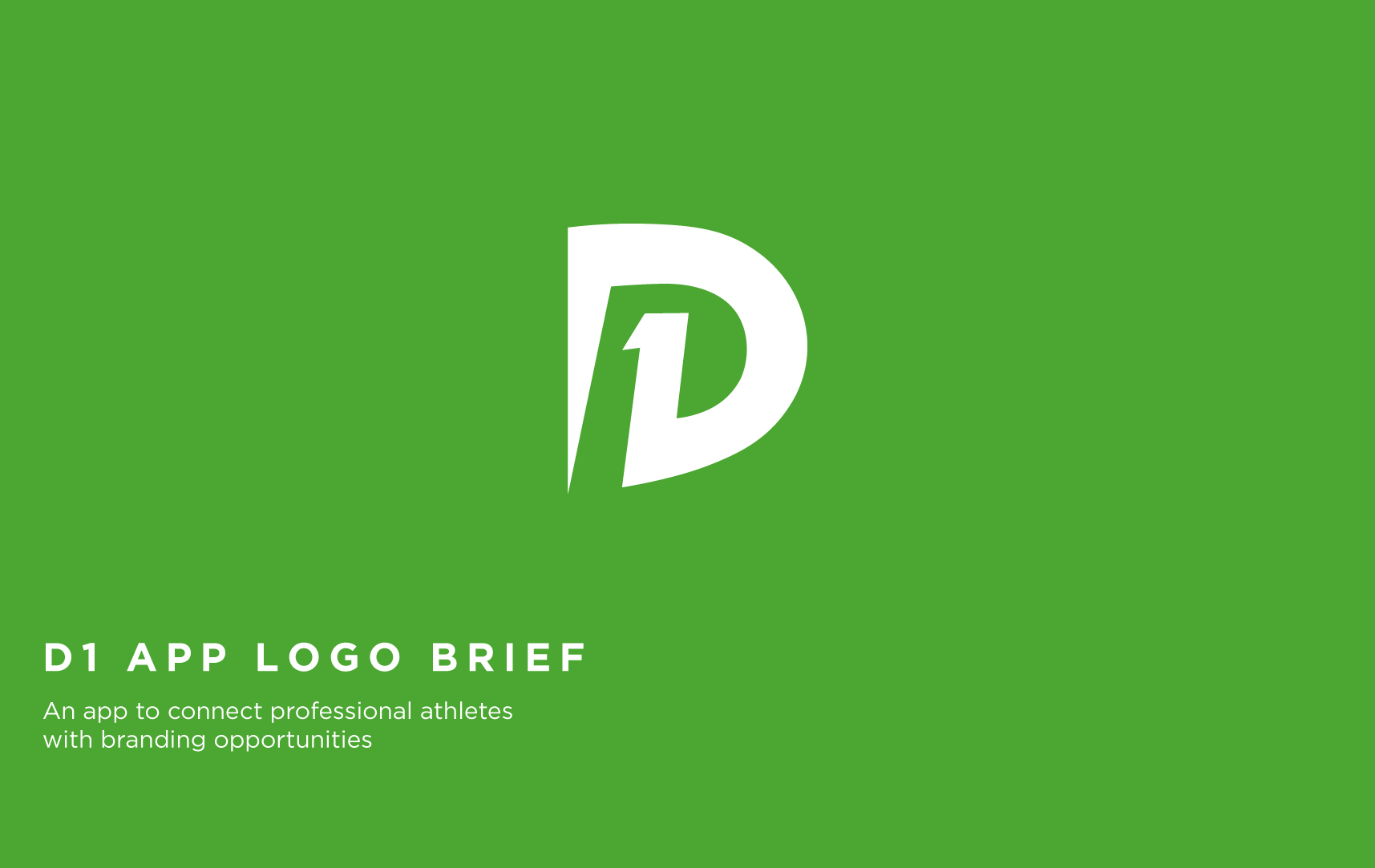
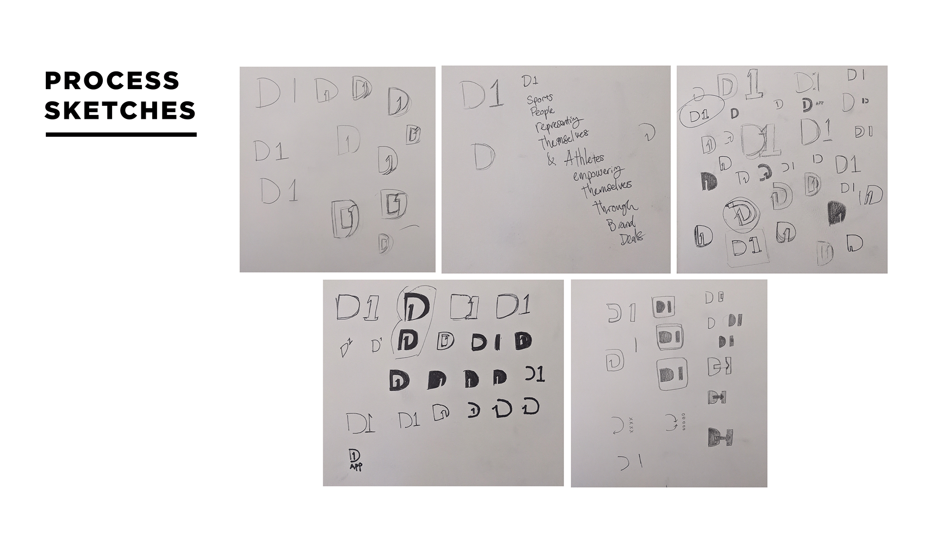
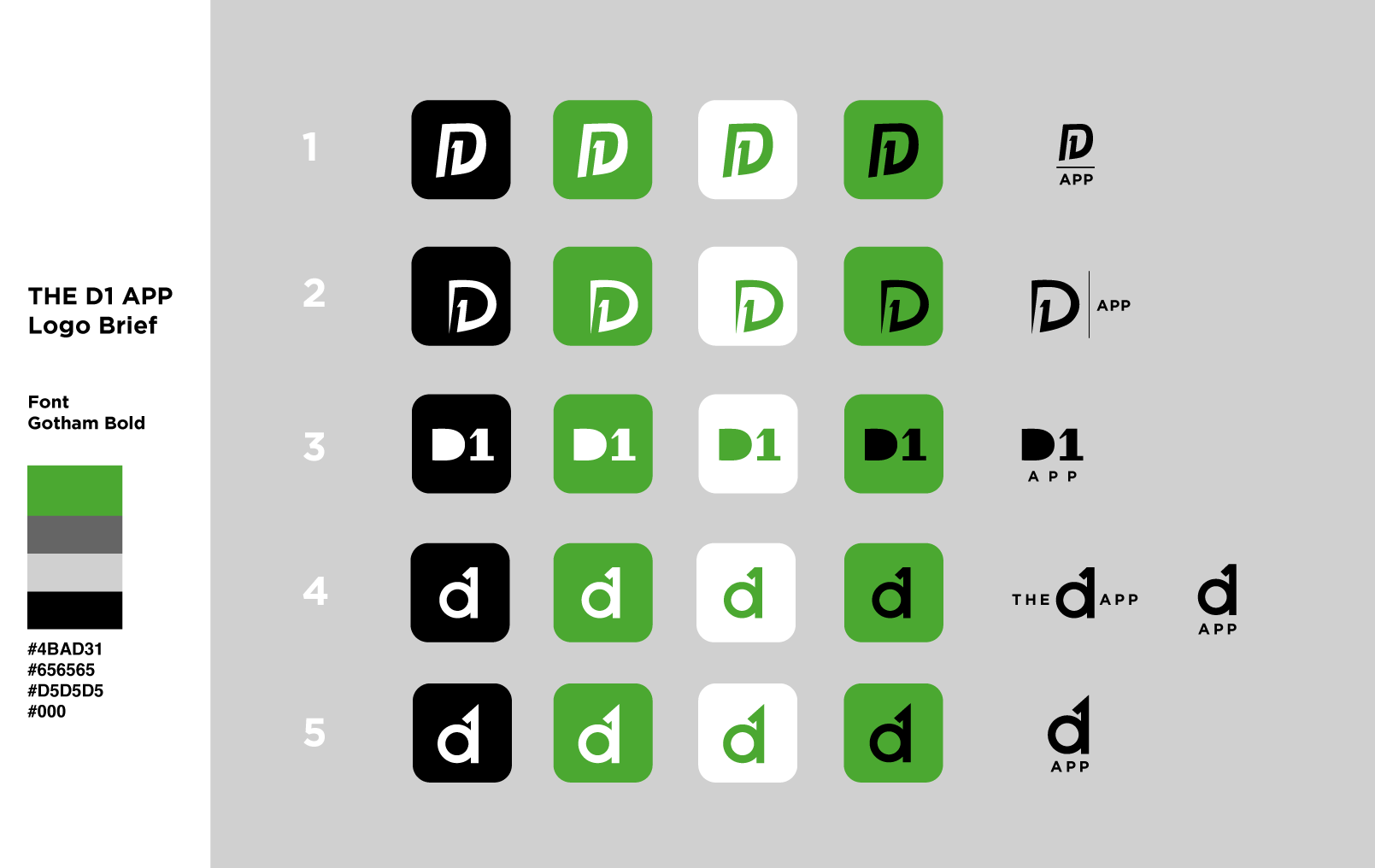
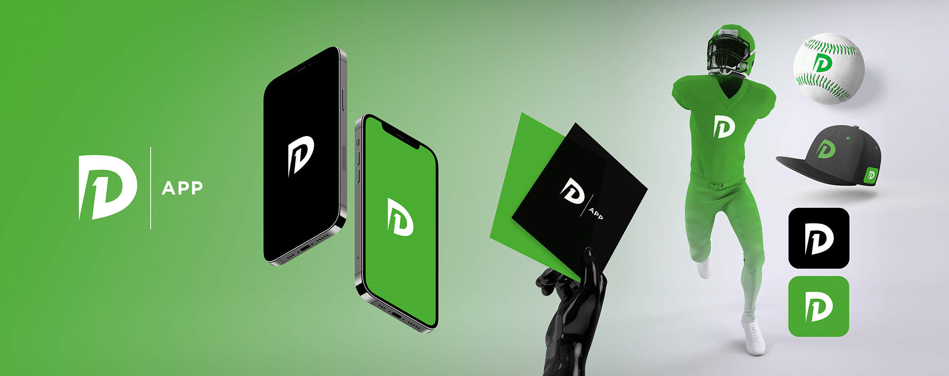
D1 APP: VISUAL IDENTITY
LOGO DESIGN
BRANDING
VISUAL IDENTITY
STARTUP
I created the full logo concept and branding kit for the D1 app, a platform designed to help Division 1 athletes connect with potential sponsors. The branding focused on strength, ambition, and professionalism, values that resonate with both athletes and sponsors. The final logo and visual identity were built to stand out in the competitive sports-tech space while remaining versatile across digital and print formats.


LOGO DESIGN
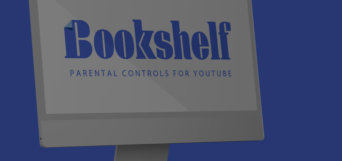
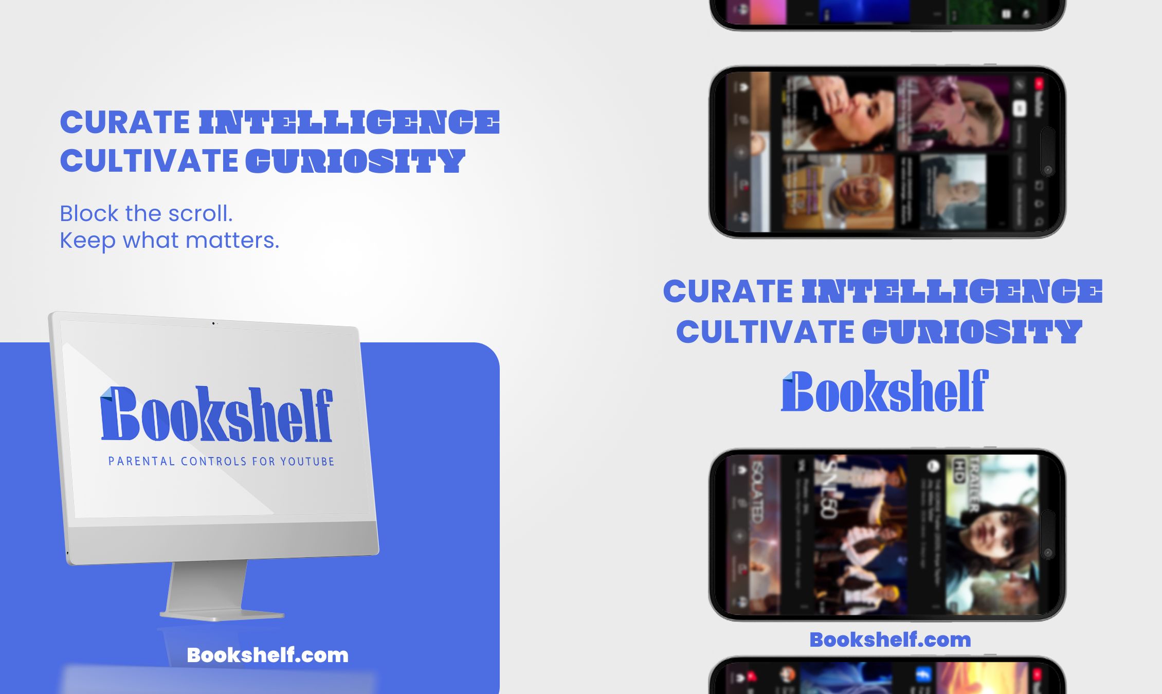
BOOKSHELF
LOGO AND BRANDING
APP DESIGN
SOCIAL MEDIA POSTS
SOCIAL MEDIA ADVERTISING
MOTION GRAPHICS
START UP
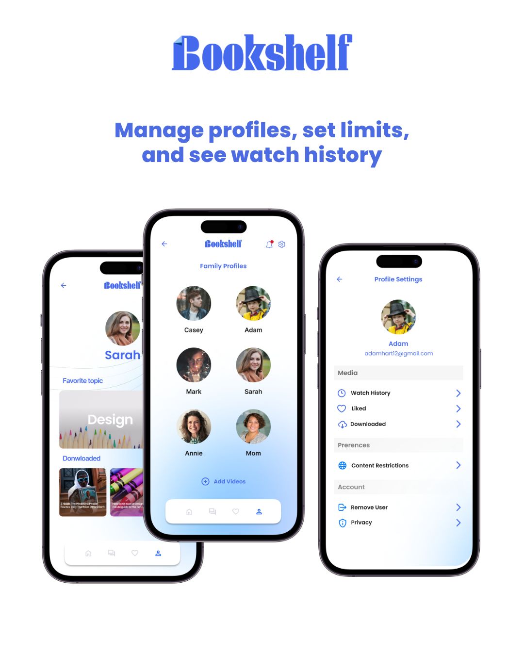
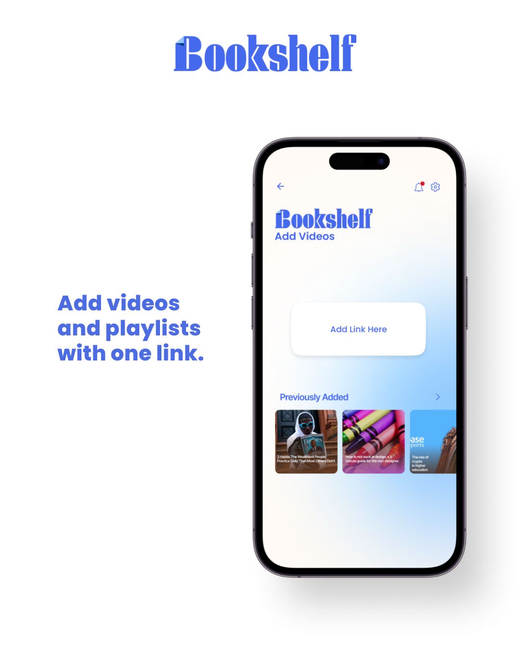
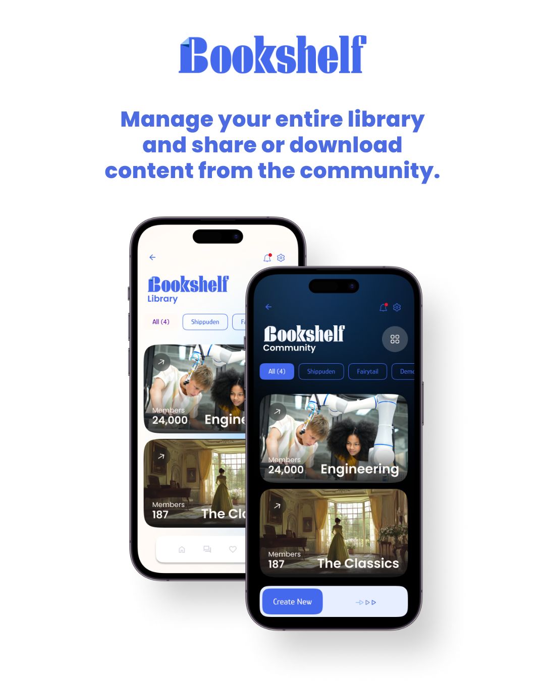
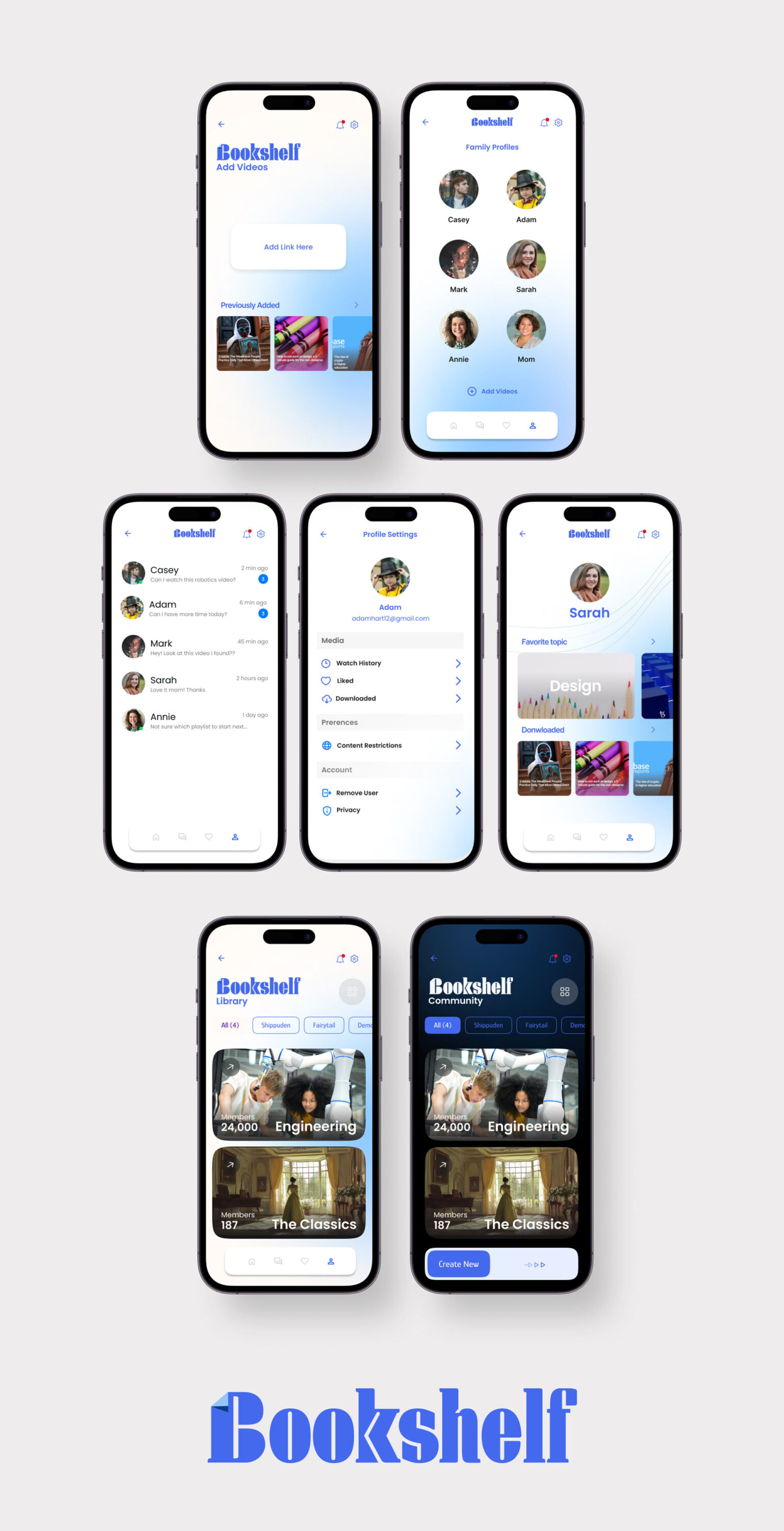
While contracting for the startup incubator Inception, I designed the app concept for Bookshelf, a video catalog and parental control platform. Bookshelf enables parents to create a permission hierarchy for their children, allowing access to curated video content from YouTube, Vimeo, and other sources while blocking inappropriate material. Additionally, it features a community page where parent admins can share and discover playlists, making it easy to expand each family’s video library with trusted recommendations.
SOCIAL MARKETING
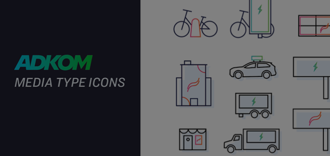
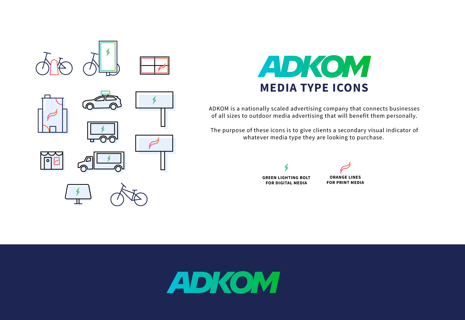
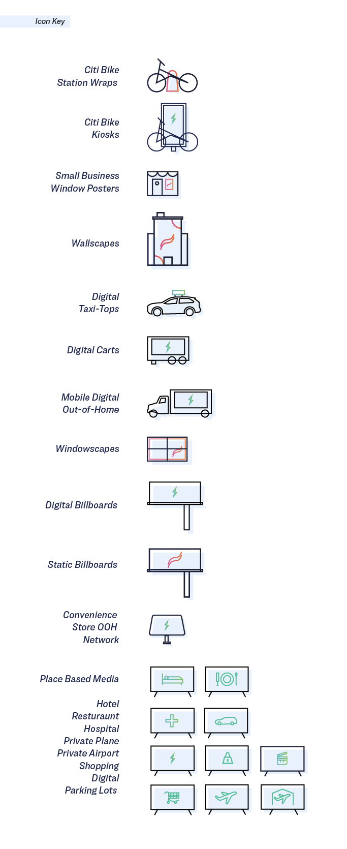
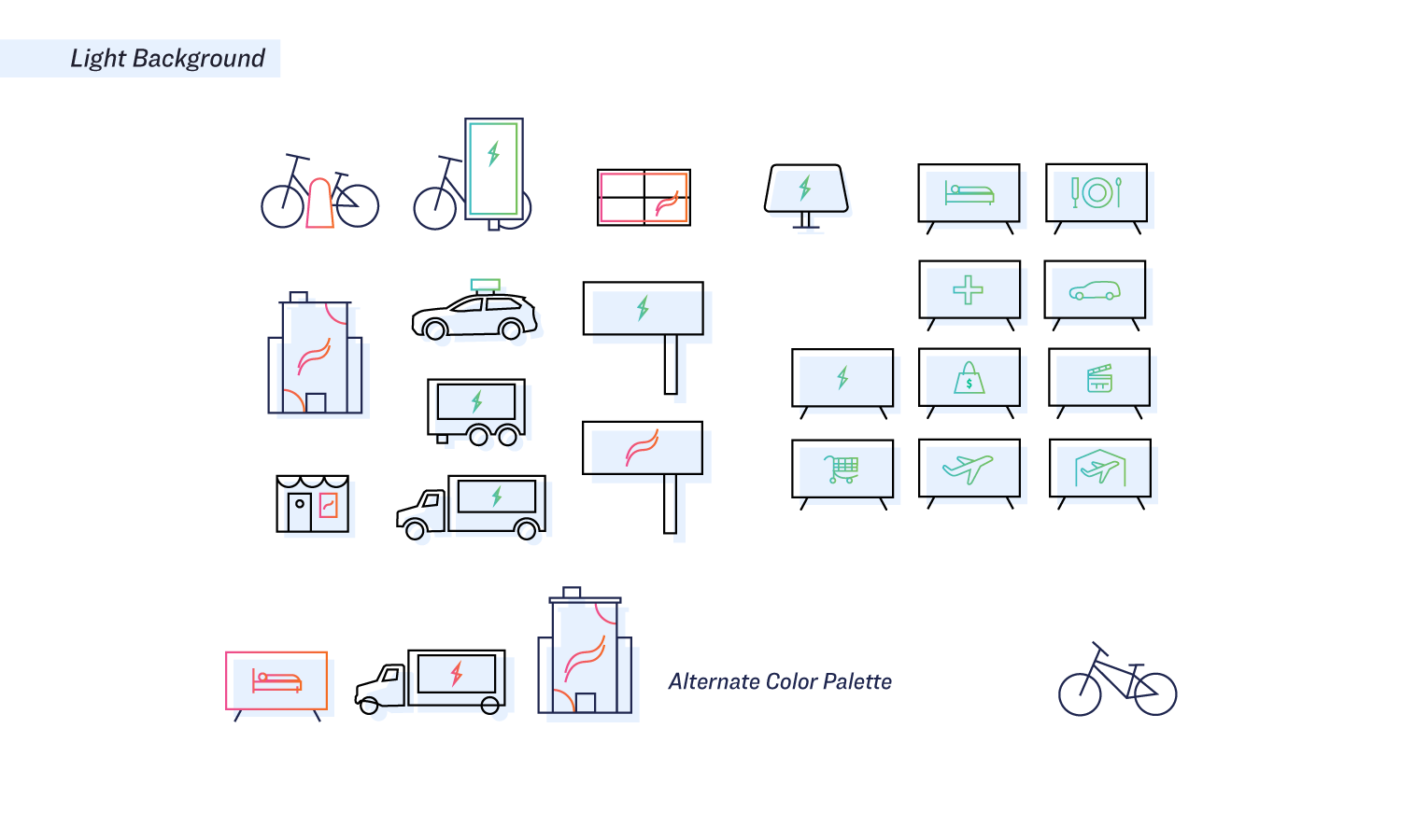
ADKOM - SPECIALTY ICON LIBRARY
ICON DESIGN
VISUAL DESIGN SYSTEMS
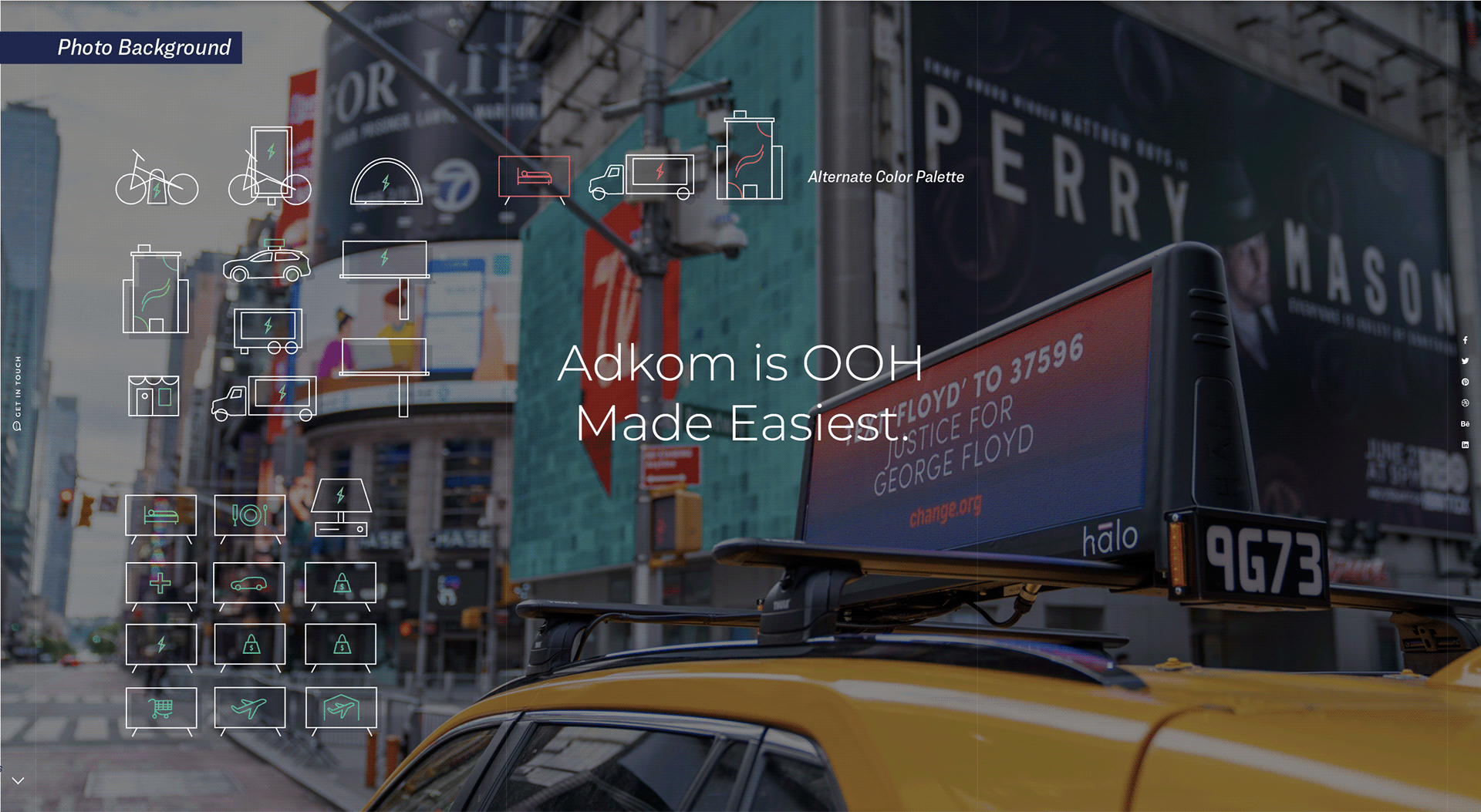
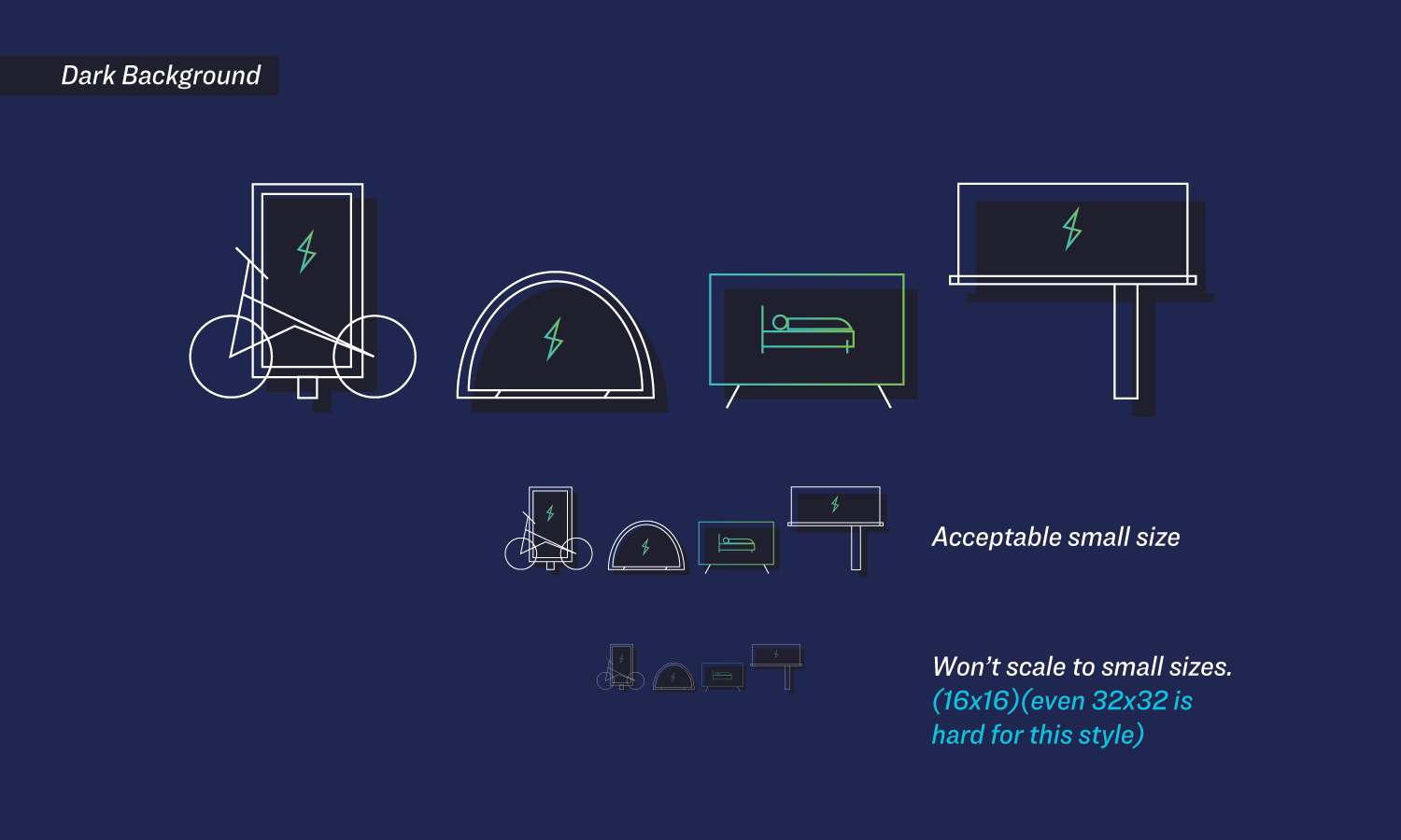
I developed the ADKOM icon library to create a cohesive visual system for the company’s extensive range of out-of-home (OOH) advertising platforms. The icons were organized into two distinct categories, electric and print. using a bold green lightning bolt for digital media and an orange swoosh for print formats. This visual identity made it easier for partners to quickly navigate ADKOM’s offerings and communicate options with clarity and consistency.

ICON DESIGN
ASPIRE WEBSITE REDESIGN
MATERIAL DESIGN
CONCEPT WORK
RESPONSIVE DESIGN
VISUAL IDENTITY
UX/UI
UTAH VALLEY UNIVERSITY
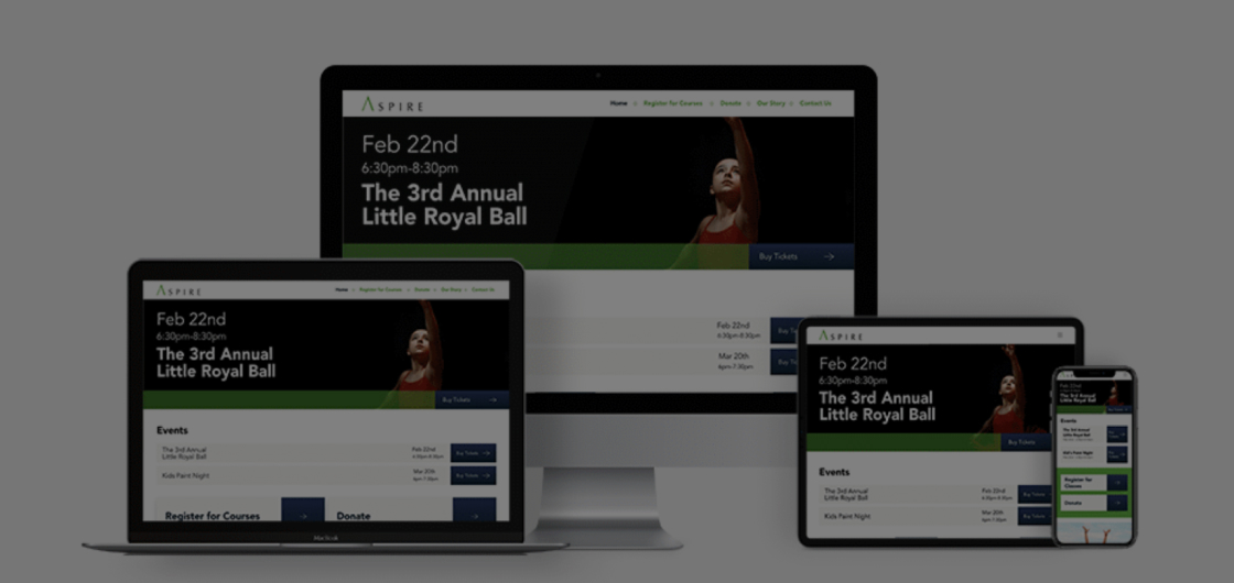
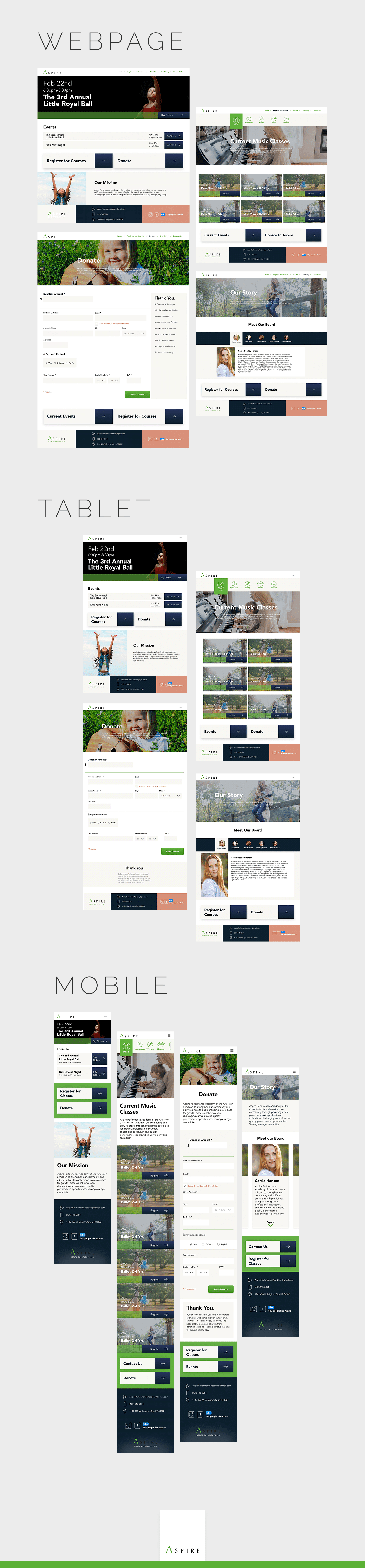
As part of an undergraduate design project, I created a fully responsive website for Aspire, a local nonprofit dance studio that teaches children Jazz, Contemporary, Ballet, and Hip Hop. Though the project was a conceptual redesign, it followed Google’s Material Design system to ensure a clean, intuitive interface across desktop, tablet, and mobile devices. Special attention was given to accessibility standards and legal compliance, making the design inclusive and aligned with real-world usability requirements.
WEBSITE
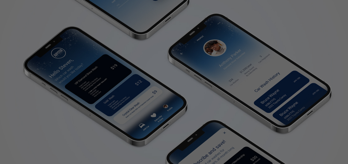
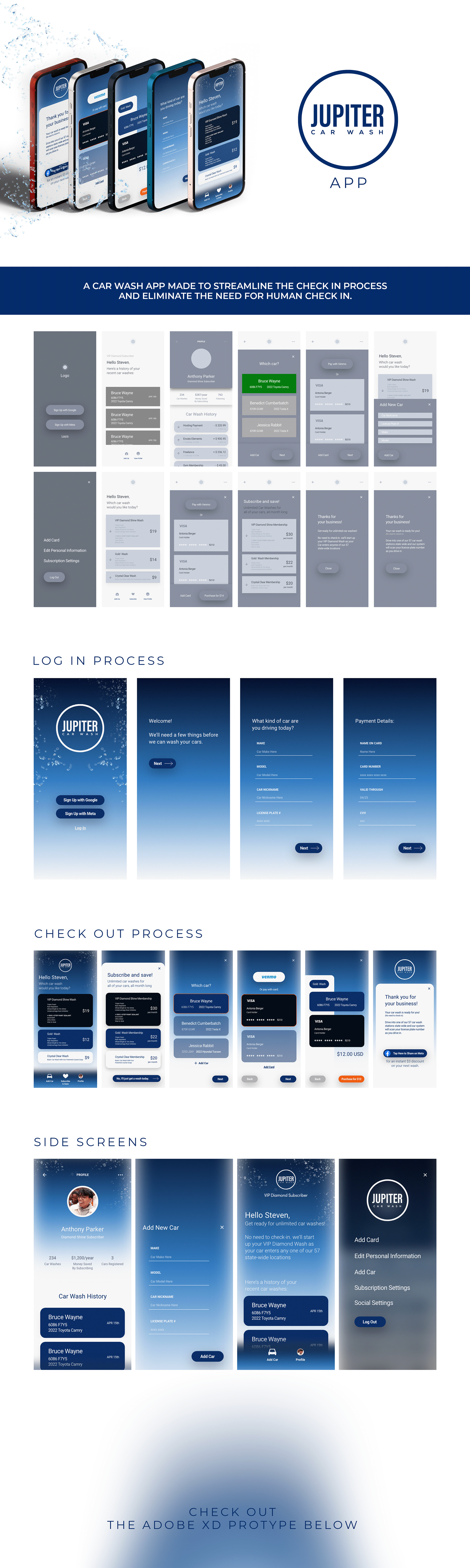
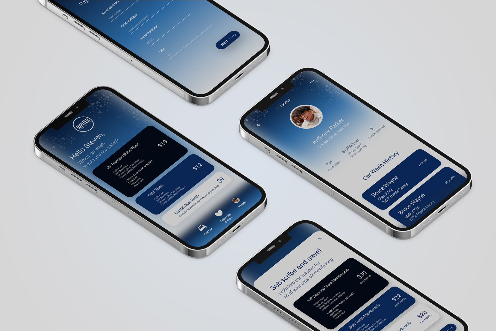
JUPITER CAR WASH: CHECK-IN APP
APP DESIGN
APP DESIGN
VISUAL IDENTITY
UX/UI
UTAH VALLEY UNIVERSITY
UNDERGRAD CONCEPT WORK
I designed the prototype for Jupiter Car Wash, an unreleased instant check-in app focused on streamlining the user experience from arrival to wash completion. Built in Adobe XD, the design prioritized clean user flows, a strong and consistent visual identity, and effortless navigation. The goal was to make the check-in process as intuitive as possible, combining bold branding with functional simplicity to ensure a smooth experience for every user.
APP PROTOTYPE
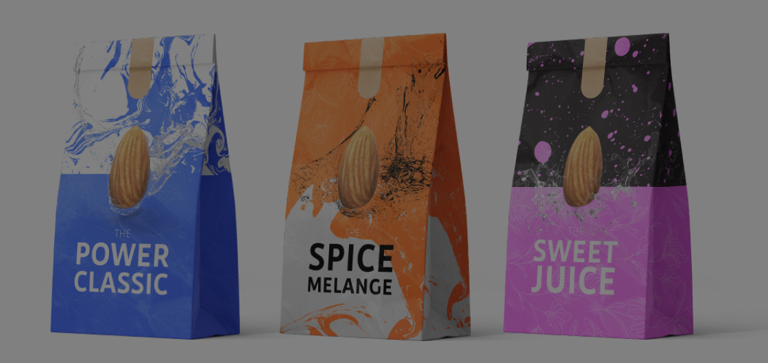
LIVING ALMONDS
CONCEPT
BRANDING
VISUAL IDENTITY
FOOD PACKAGING
Living Almonds was a personal passion project focused on creating a clean, environmentally friendly line of flavored and spiced almonds. I developed the full concept design, including the logo, website, and packaging for a variety of globally inspired flavors like “Miso Sriracha,” “Thai Curry,” and “Mango Coconut.” One standout flavor, “The Spice Melange,” paid homage to the Dune series with a sci-fi twist. The branding emphasized natural ingredients, sustainability, and bold, adventurous flavor profiles, combining visual storytelling with mindful design.
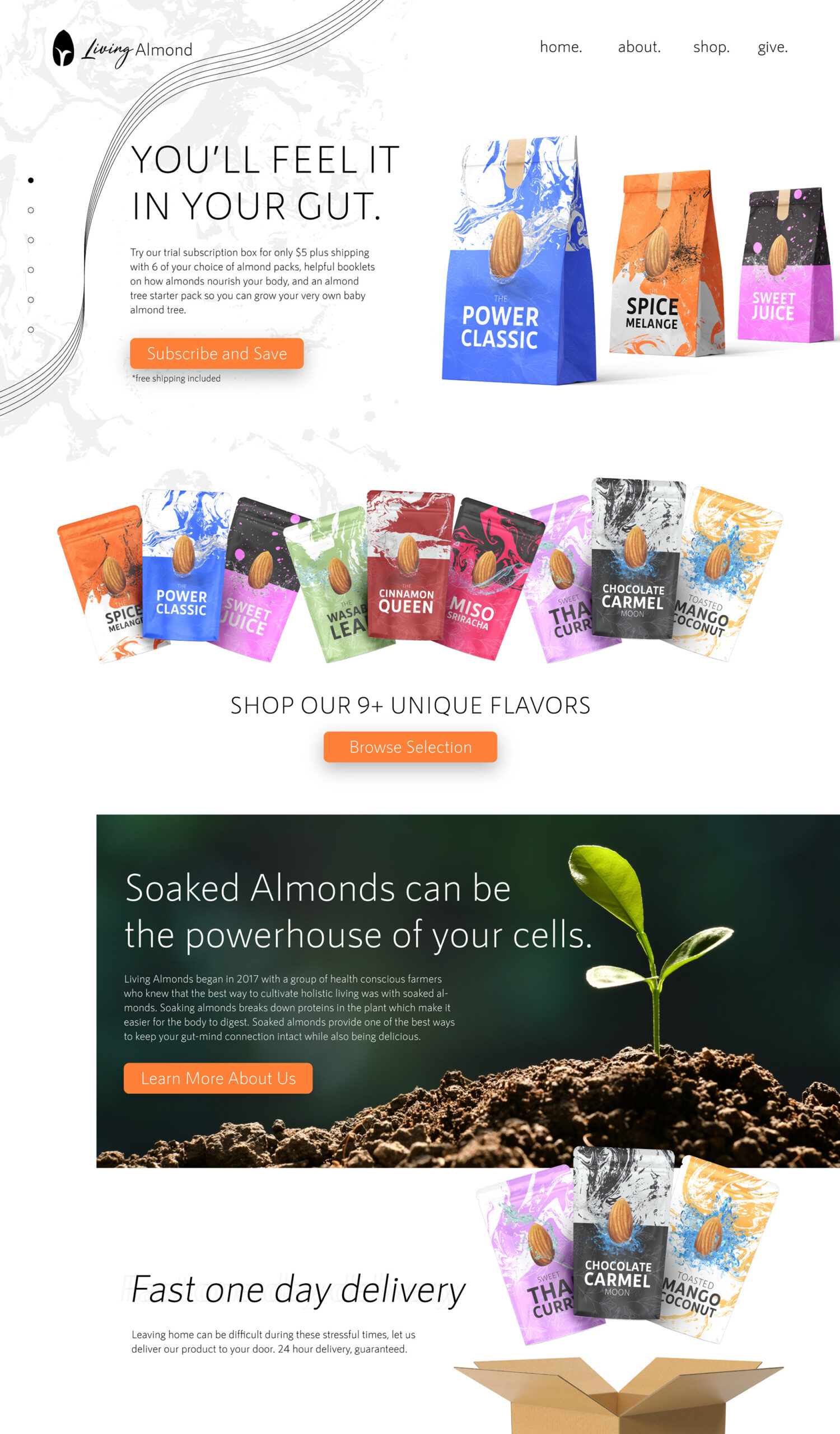
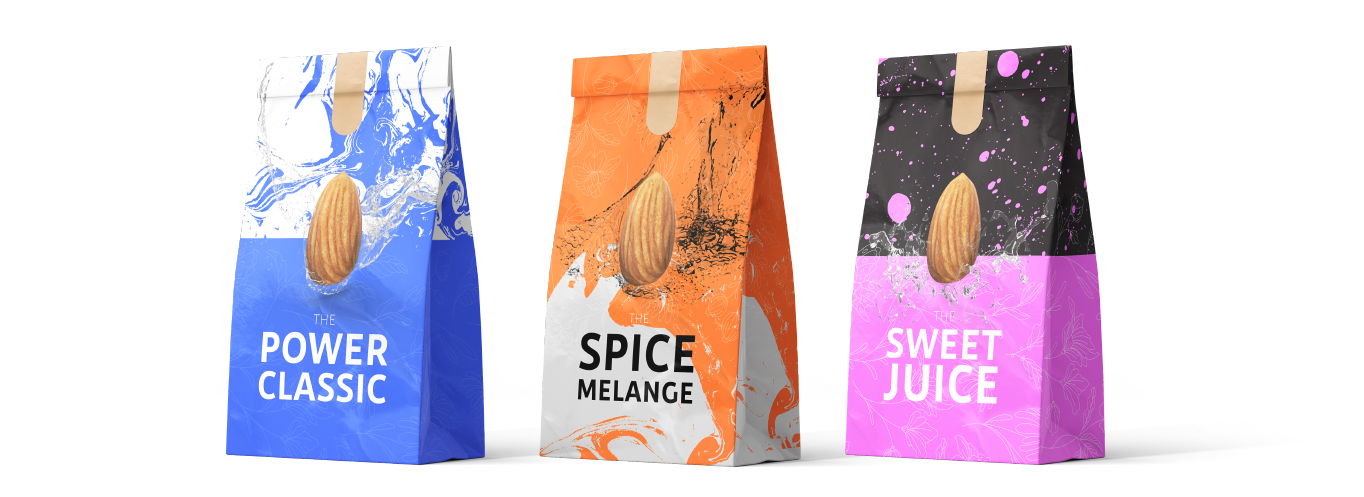
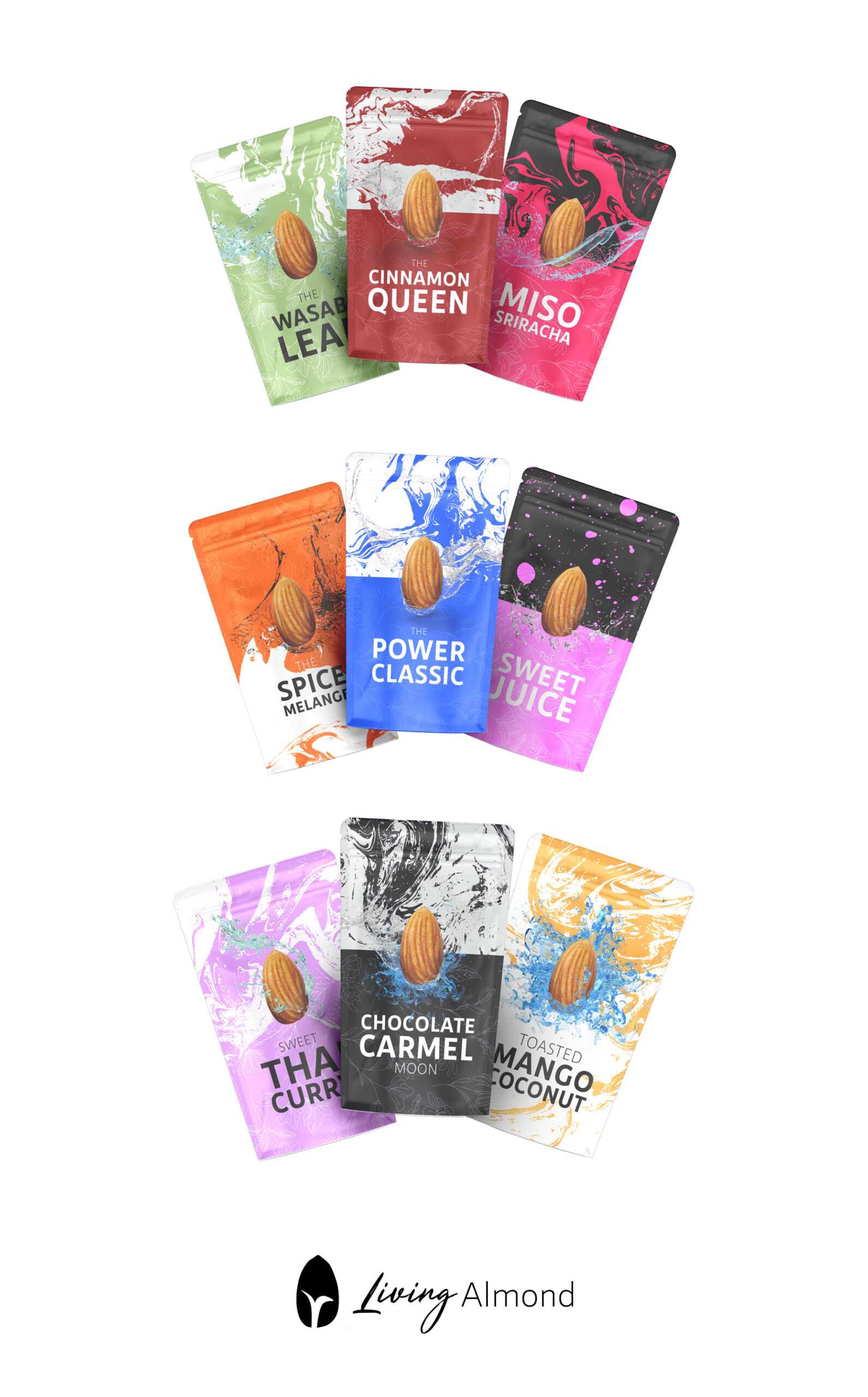
PACKAGING
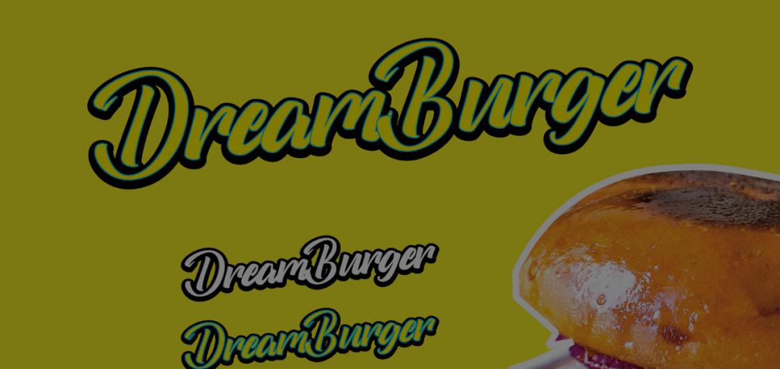
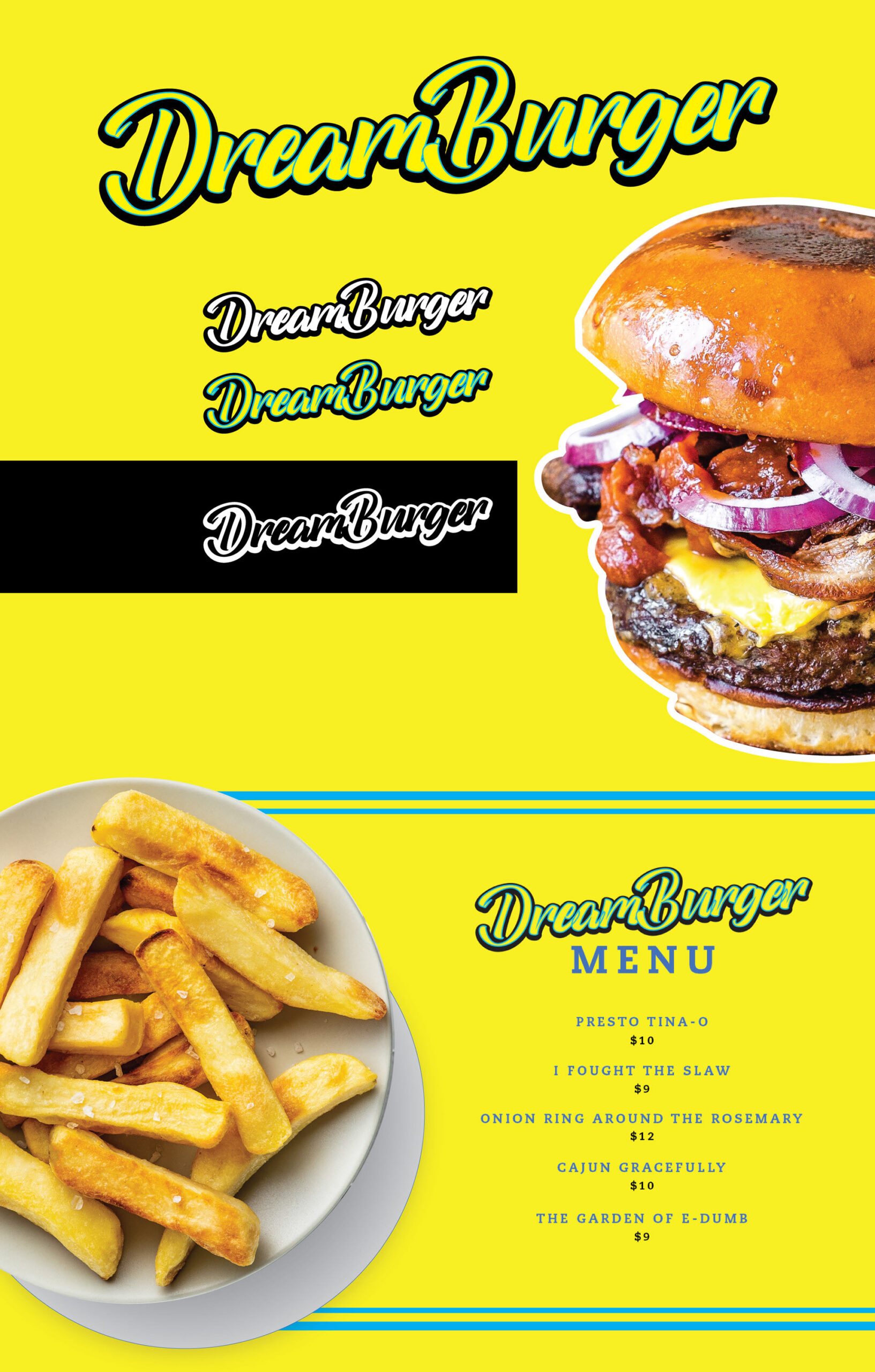
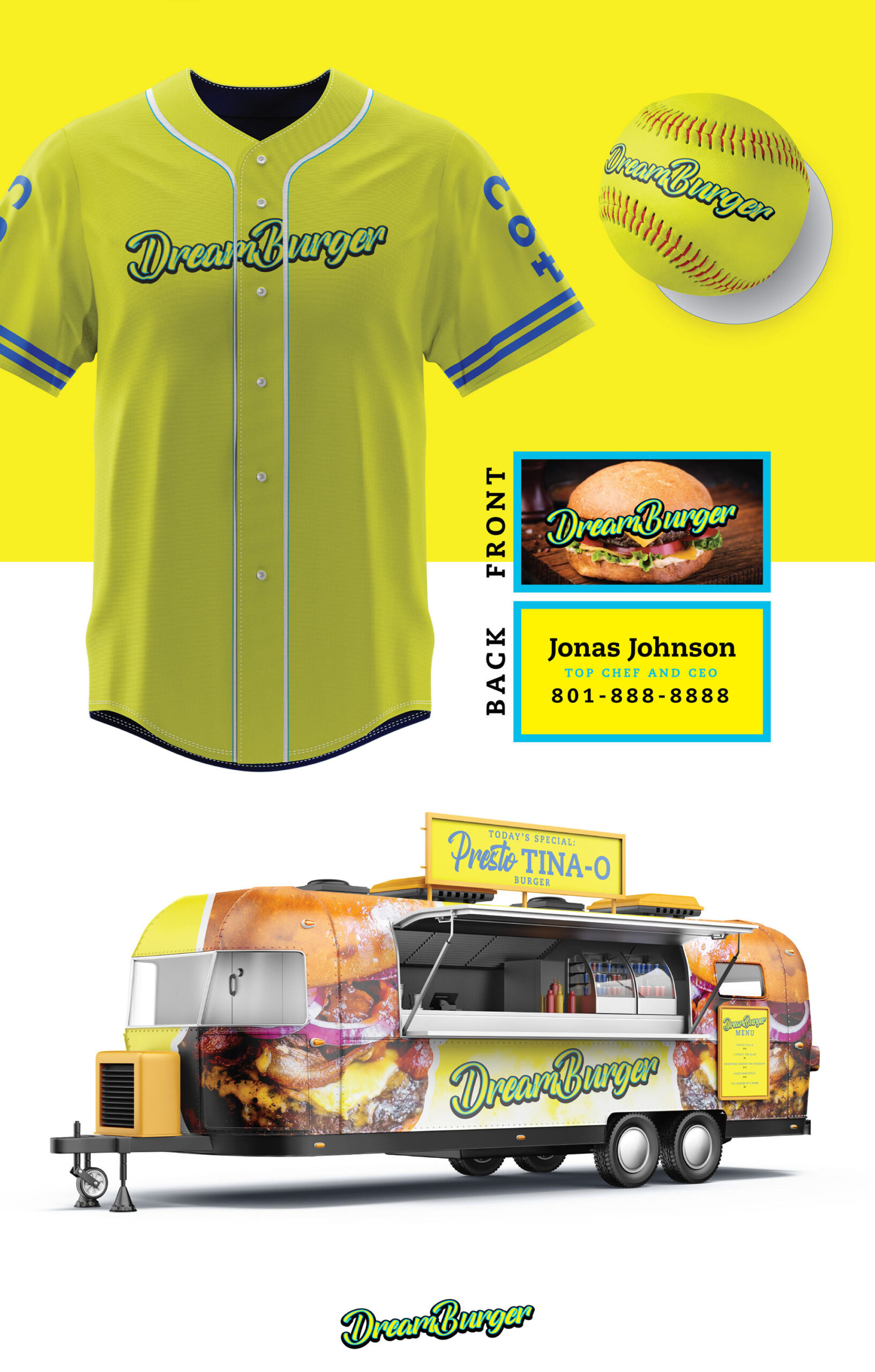
DREAM BURGER
LOGO AND BRANDING
TRUCK DESIGN
MENU DESIGN
BUSINESS CARDS
START UP
I created the app design concept for Dream Burger, a food truck inspired by the beloved show Bob’s Burgers. This project was a special commission from my cousin-in-law, who had always dreamed of starting their own food truck. It was a fun opportunity to bring their vision to life and support family to take their first step in making a dream a reality.
SHOP DESIGN
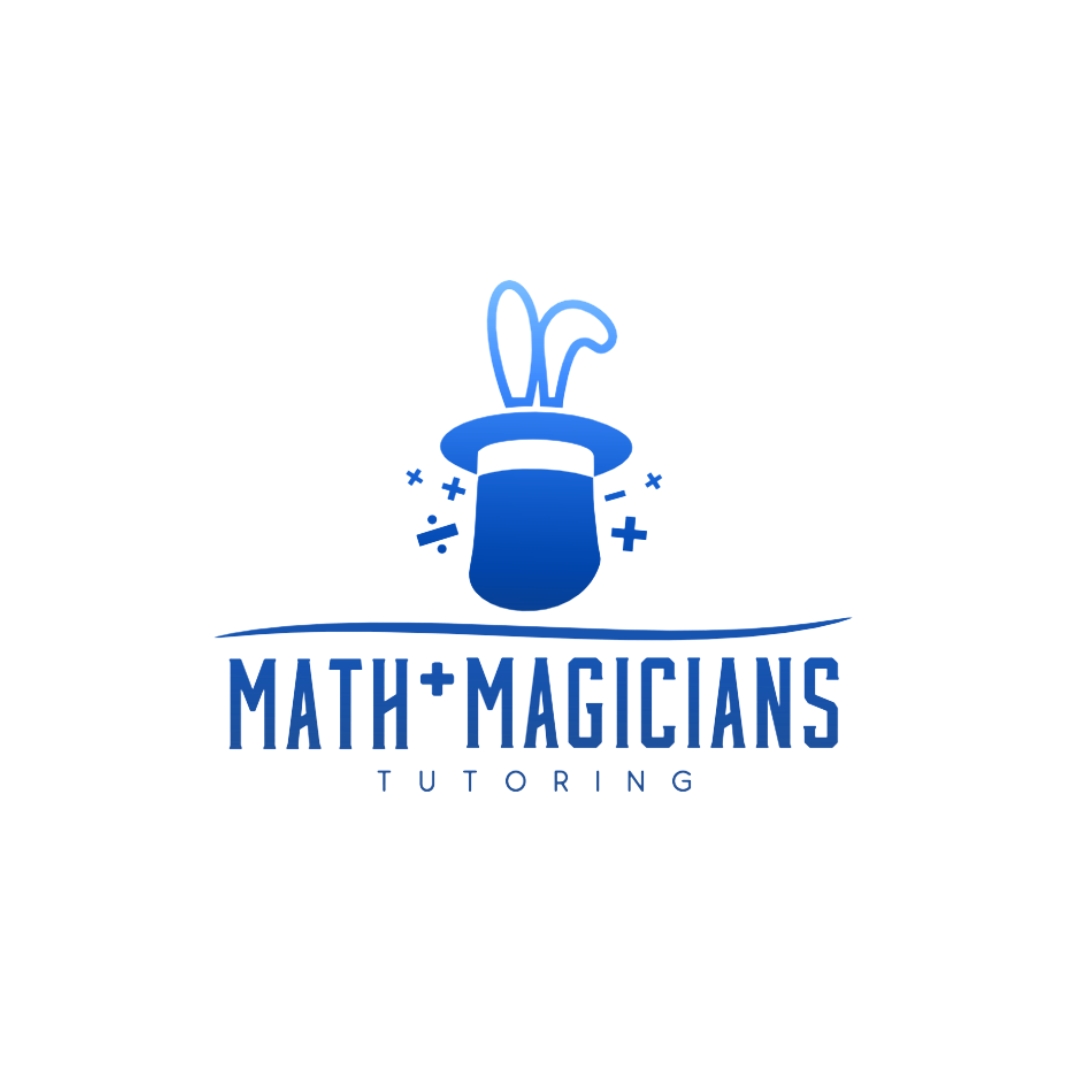
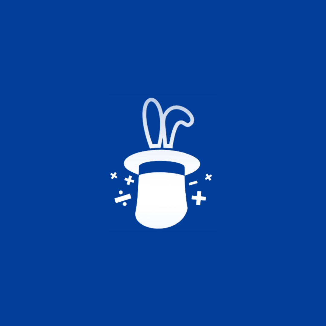
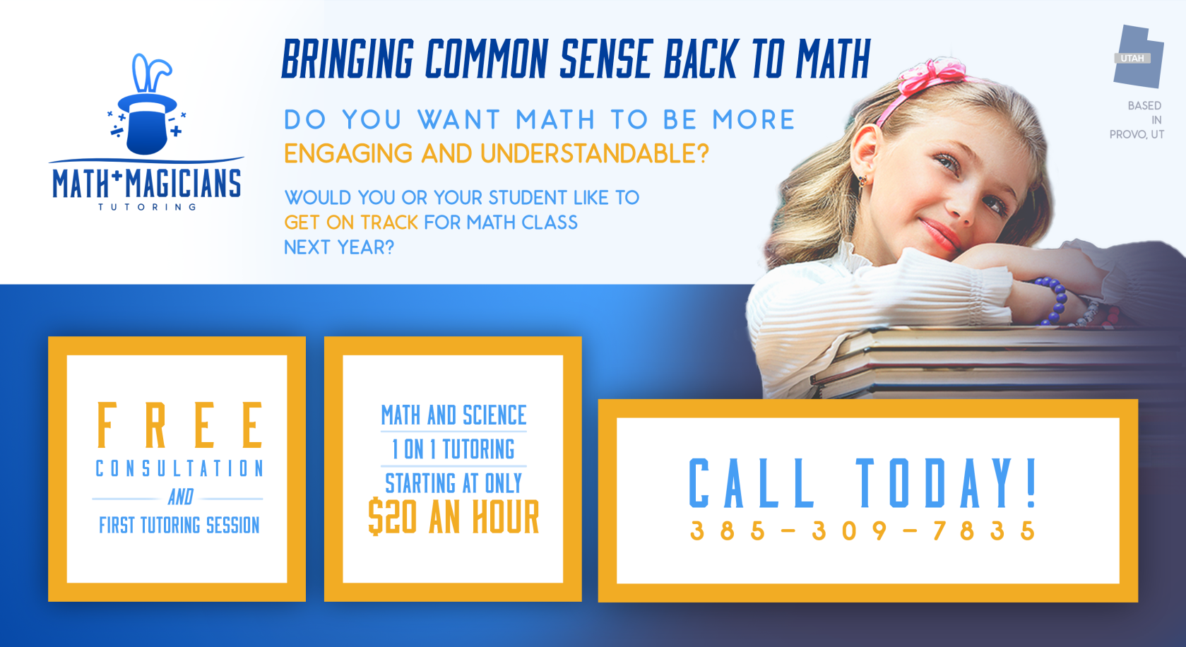
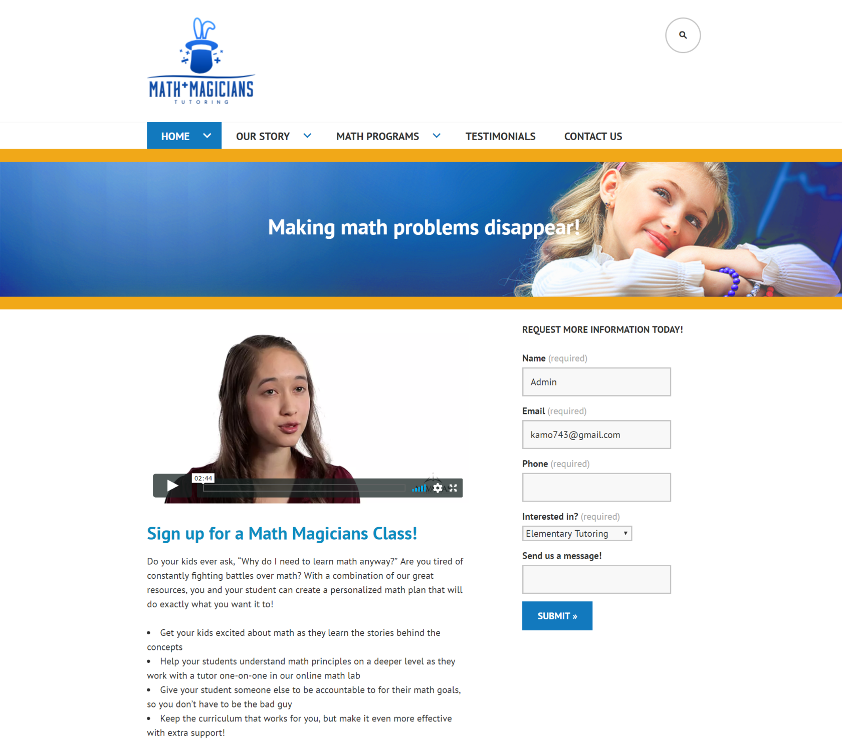
Math Magicians
WEB DESIGN
BRANDING
START-UP
2018-2020
Math Magicians is a Utah-based tutoring business focused on making math approachable for both parents and children. I worked with the company for two years as a part-time contractor between 2018-2020. My main roles consisted of developing the brand identity, creating a simple wordpress website for parent sign up, and print and event marketing materials. Through collaborative strategy discussions, we established a visual direction that balanced professionalism and trust with a friendly, kid-appropriate tone. The final identity, built around a restrained blue-and-orange palette and a custom logo mark, helped differentiate the brand within the tutoring space. I also designed and built a WordPress website optimized for parent conversion and easy post-handoff management, along with supporting flyers designed to drive direct inquiries.


Design